Groovy Hues of the 70s: A Blast from the Past
The 1970s were a vibrant explosion of color, reflecting a decade of significant cultural shifts and self-expression. From the earthy tones inspired by nature to the electrifying hues of the disco era, the 70s color palette continues to captivate and inspire. Let’s journey back to this iconic decade and explore the colors that defined an era.
Earthy Vibes: Connecting with Nature
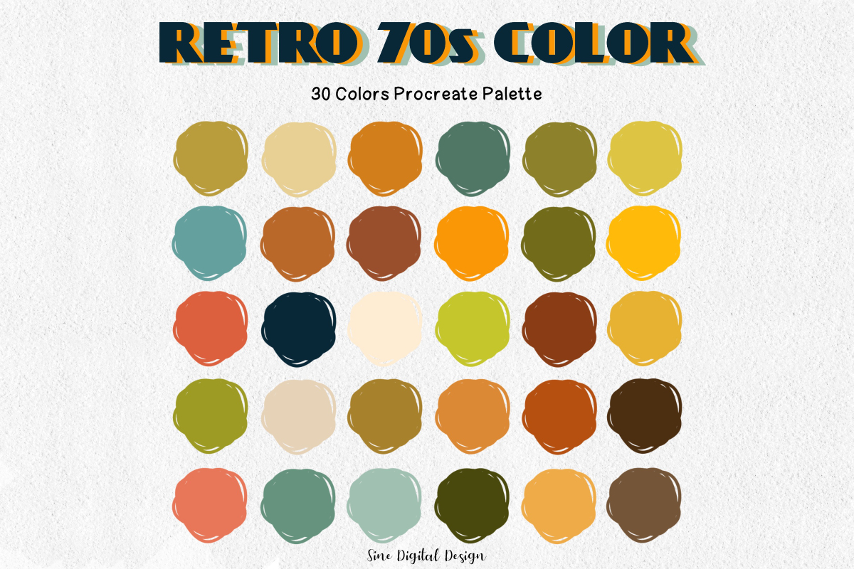
The 70s saw a surge in environmental awareness, and this was reflected in the popularity of natural, earthy color palettes. Think warm browns reminiscent of fertile soil, muted greens evoking lush forests, burnt oranges mimicking breathtaking sunsets, and golden yellows like fields of sunflowers. These colors brought a sense of peace, simplicity, and grounding during a time of rapid technological advancement.
Disco Fever: Where Color Met Energy
The 70s wasn’t just about mellow vibes; it was also the era of disco—a time to let loose on the dance floor under a glittering disco ball. Imagine the pulsating energy of electric blues, the attention-grabbing boldness of hot pinks, the radiating warmth of glowing oranges, and the touch of glamour added by shimmering golds. These weren’t merely colors; they embodied freedom, self-expression, and pure joy.
Bohemian Rhapsody: A Tapestry of Rich Hues
The 70s also saw the rise of bohemian style, which embraced creativity, free-spirited adventure, and a fascination with global cultures. Picture rich jewel tones like treasures from a dragon’s hoard: deep emerald green, dazzling sapphire blue, and mysterious amethyst purple. These luxurious hues, often paired with earthy browns and shimmering gold, spoke to artistry, travel, and embracing life to the fullest.
Iconic 70s Color Palettes: Ready to Use
Ready to infuse your designs with a touch of 70s magic? Here are a few iconic color combinations to inspire you:
| Palette Name | Colors | Hex Codes |
|---|---|---|
| Far Out | Mustard Yellow, Olive Green, Burnt Orange | #D4A017, #808000, #B7410E |
| Dream On | Sky Blue, Lavender, Pale Pink | #87CEEB, #E6E6FA, #FFB6C1 |
| Groovy | Hot Pink, Lime Green, Electric Blue | #FF0080, #00FF00, #0000FF |
The Enduring Legacy of 70s Colors
The 70s color palette continues to influence design trends across various disciplines.
- Graphic Design: Bold logos, energetic websites, and packaging with a retro-cool aesthetic often draw inspiration from 70s color schemes.
- Interior Design: Imagine rooms adorned with vintage furniture, funky patterns, and pops of vibrant color—the 70s aesthetic is back!
- Fashion: Iconic 70s styles are constantly being reimagined, from flared jeans and platform shoes to flowy dresses and statement jewelry.
The 70s color palette isn’t just a nostalgic trend; it’s a testament to the timelessness of certain aesthetics. These colors evoke a sense of nostalgia while remaining surprisingly fresh and relevant today. Whether you’re a designer, artist, or someone who simply loves to express themselves through color, the 70s palette offers a vibrant and expressive way to bridge the past with the present.
Outperforming the Competition: What Were the Popular Colors in the 1970s?
The 1970s color palette was more than just avocado green and harvest gold; it was a dynamic fusion of nature-inspired earth tones and the electrifying vibrancy of the disco era. Muted browns, oranges, and greens provided a grounding backdrop for bursts of sunny yellows, playful pinks, and bold purples, creating a unique visual language for the decade.
The Influence of Cultural Movements
The colors of the 70s were deeply intertwined with the social and cultural movements of the time:
-
The Hippie Movement: This counterculture movement embraced natural living and rejected consumerism. Their preference for earthy tones like browns, greens, and oranges, often seen in hand-dyed textiles and macrame crafts, reflected their connection to nature.
-
The Environmental Movement: Growing awareness of environmental issues led to a desire for colors that evoked nature. Avocado green appliances, for example, were seen as a way to bring the outdoors in.
-
The Disco Era: Disco was all about letting loose and celebrating individuality. This was reflected in the bold, vibrant colors like hot pink, electric blue, and lime green that dominated disco fashion and interior design.
A Spectrum of Hues: From Earthy to Electric
Here’s a closer look at the specific colors that defined the 70s:
Earth Tones:
-
Muted browns: Chocolate brown, taupe, and beige were popular choices for furniture, wall coverings, and carpets. They created a sense of warmth, coziness, and groundedness.
-
Deep greens: Avocado green was the shade of green in the 70s. It was everywhere—on appliances, kitchen cabinets, and even bathroom fixtures! This rich, natural hue symbolized peace, tranquility, and a connection to the natural world.
-
Burnt oranges: Burnt orange and rust were warm, inviting colors that added a touch of spice to 70s interiors. They were often used on couches, curtains, and throw pillows.
-
Golden yellows: Harvest gold was another popular shade in the 70s. This sunny yellow brought a cheerful, welcoming vibe to kitchens and living rooms.
Vibrant Hues:
-
Electric blue: This bright, almost neon blue was synonymous with the energy and excitement of the disco era. It was a popular choice for clothing, lighting fixtures, and even cars!
-
Hot pink: Hot pink was a bold, unapologetically feminine color that represented confidence, playfulness, and a rejection of traditional gender roles. It was a favorite for clothing, accessories, and makeup.
-
Lime green: Lime green was a zesty, refreshing color that added a burst of energy to any space. It was often used on walls, furniture, and even appliances.
-
Bright purple: Purple was associated with luxury, creativity, and a touch of mystery. It was a popular choice for clothing, home decor, and even cars.
-
Sunshine yellow: This vibrant yellow evoked feelings of happiness, optimism, and pure joy. It was often used on walls, furniture, and accessories to create a cheerful and uplifting atmosphere.
The Enduring Influence of 70s Colors
What’s remarkable is how the 70s color palette continues to pop up even today. It’s like a blast from the past that never gets old! This enduring appeal could be attributed to several factors:
-
Nostalgia: The 70s were a time of significant cultural change, and many people associate the colors of that era with happy memories.
-
Uniqueness: The 70s color palette is distinct from other decades, with its unique blend of earthy and vibrant hues.
-
Versatility: The colors of the 70s can be used in a variety of ways to create different moods and aesthetics.
From fashion to interiors, the 1970s color palette continues to inspire contemporary design, proving its enduring influence and aesthetic appeal.
If you’re looking to spruce up your home with a touch of retro flair, be sure to check out our collection of 60s kitchen décor. From groovy patterns to bold colors, we have everything you need to create a swinging space that will transport you back to the era of peace and love. And if you’re a fan of 70s style, you’ll love our selection of 70’s homes for sale. With their open floor plans, shag carpeting, and avocado green appliances, these homes are a time capsule of a bygone era.
Unlocking the 70s Design Palette: A Deep Dive
The 1970s were a time of immense cultural and social change, and these shifts were mirrored in the decade’s distinctive design aesthetics. Beyond the well-known avocado green and harvest gold, the 70s embraced a spectrum of hues, reflecting a yearning for nature’s calm amidst social change, expressed through bold self-expression.
Setting the Stage: Cultural Influences on 70s Design
-
A Return to Nature: The early 70s witnessed a surge in environmental awareness and a rejection of mass-produced goods. This led to a renewed appreciation for natural materials, handcrafted items, and colors inspired by the earth.
-
The Rise of Individualism: As the decade progressed, self-expression took center stage. People were no longer afraid to embrace bold colors, patterns, and textures that reflected their unique personalities. The rise of disco further fueled this trend, as people sought to escape into a world of vibrant energy and abandon.
-
Maximalism Reigns: Unlike the minimalist trends that followed, the 70s embraced maximalism. Clashing prints and patterns, bold color combinations, and an abundance of texture were hallmarks of the era’s design aesthetic. More was definitely more!
Decoding the 70s Color Palette: A Deeper Look
-
Earth Tones: Browns, oranges, greens, beige, and gold were not just individual colors but foundational elements in 70s design. These earth tones conveyed warmth, comfort, and a sense of groundedness. They were frequently used in furniture upholstery, wall coverings, macrame wall hangings, and even kitchen appliances.
-
Bright Hues: While earthy tones provided a sense of grounding, bright hues injected personality and energy. Yellows, pinks, purples, teals, and oranges were used strategically to create contrast and visual interest. These colors were prominent in fashion, graphic design (think psychedelic posters and album covers), and, of course, disco culture.
-
Color Combinations: The 70s were all about unexpected pairings. Orange and brown, yellow and green, pink and purple—combinations that might seem jarring today were embraced for their playful eclecticism. This willingness to experiment with color created a sense of vibrancy and individuality that defined the era’s design aesthetic.
70s Colors in Action: From Interiors to Graphics
-
Interior Design: Shag carpets in vibrant colors, wood paneling that brought warmth, macrame wall hangings that added texture, and, yes, those brightly colored appliances were all signature elements of 70s interior design.
-
Fashion: Bell bottoms, platform shoes, tie-dye shirts, and psychedelic prints dominated the fashion scene. The 70s were all about pushing boundaries and embracing a sense of freedom through personal style.
-
Graphic Design: The 70s saw a revolution in graphic design, with bold typography, geometric shapes, and vibrant color palettes taking center stage. Album covers, posters, advertisements—all embraced the era’s love for color and experimentation.
The Legacy of 70s Colors: Still Grooving Today
The influence of 70s design is undeniable, even decades later. The color palettes of that era continue to inspire designers across various disciplines.
-
Enduring Appeal: Perhaps it’s nostalgia for a simpler time or the sheer vibrancy of the era’s aesthetic, but 70s color palettes continue to resonate with designers and design enthusiasts alike.
-
Modern Interpretations: Contemporary designers often reinterpret 70s colors with a modern twist. Instead of recreating the look verbatim, they incorporate elements of the 70s aesthetic—a touch of burnt orange here, a pop of avocado green there—to add a sense of retro cool to minimalist spaces, graphic designs, and even fashion accessories.
From groovy patterns on shag carpets to the sunset hues of iconic album covers, 70s color palettes continue to inspire designers today. By understanding the cultural context and clever color combinations, you can harness the power of 70s colors to create visually stunning and emotionally resonant designs.
Let’s Groove: Analyzing 70s Disco Colors
The 70s disco era was more than just a musical genre; it was a cultural phenomenon that embraced liberation, self-expression, and, of course, a whole lot of glitter and glam. Central to this movement was its iconic color palette—a visual symphony of bold hues and shimmering metallics that mirrored the energy and euphoria of the dance floor.
Setting the Stage: From Earthy Roots to Disco Nights
-
Early 70s: The early years of the decade were marked by a back-to-nature movement, reflected in the popularity of earthy tones like avocado green, harvest gold, and burnt orange. These colors were prevalent in home decor, fashion, and even appliances, representing a desire for simplicity and a connection to the natural world.
-
Mid to Late 70s: As disco fever swept the globe, the color palette shifted to reflect the high-energy vibe of the dance floor. Electric blues, hot pinks, and lime greens became synonymous with the disco scene, while metallic silver and gold added a touch of glamour and sophistication.
The Disco Color Palette: A Breakdown
| Color Family | Specific Hues | Symbolism/Associations |
|---|---|---|
| Earthy Tones | Mustard Yellow | Optimism, warmth, a nostalgic nod to the psychedelic 60s |
| Avocado Green | Nature, peace, a reaction against industrial aesthetics | |
| Burnt Orange/Rust | Warmth, comfort, reminiscent of the American Southwest | |
| Electric Hues | Electric Blue | Energy, vibrancy, futuristic vibes, the pulse of the night |
| Hot Pink | Confidence, playfulness, breaking traditional gender norms | |
| Lime Green | Youthfulness, excitement, a sense of the unexpected | |
| Glam Metallics | Silver | Glamour, sophistication, mirroring the disco ball’s effect |
| Gold | Luxury, opulence, a sense of celebration |
More Than Just Colors: Disco’s Visual Language
Disco wasn’t just about the music; it was a multi-sensory experience, and color played a vital role in creating its unique atmosphere.
-
Disco Fashion: Bell bottoms, platform shoes, jumpsuits, and slinky dresses—all were rendered in a riot of color. Hot pink was a popular choice for those who dared to stand out, while electric blue and silver created a futuristic vibe.
-
Interior Design: Disco interiors were all about creating a sense of immersive energy. Shag carpets in vibrant colors, walls adorned with bold geometric patterns, and, of course, the ever-present disco ball, reflecting light in a multitude of colors, were all signature elements.
-
Graphic Design: Album covers embraced the disco aesthetic with psychedelic fonts, abstract shapes, and, of course, vivid color palettes. These designs were meant to capture the eye and evoke the energy and excitement of the music.
The 70s Disco Revival: A Timeless Aesthetic
The influence of 70s disco isn’t confined to the past; it continues to inspire designers and creatives today.
-
Fashion: From Gucci runways to street style, 70s silhouettes and colors are experiencing a resurgence. Think high-waisted pants, platform shoes, and bold prints—all infused with a modern sensibility.
-
Interior Design: Mid-century modern furniture, a renewed love for earthy tones, and the strategic use of vibrant accents are bringing 70s vibes back into homes.
-
Branding & Digital: Even in the digital realm, 70s disco colors are making a statement. Websites, logos, and social media graphics are incorporating retro color palettes to evoke nostalgia, grab attention, and stand out from the crowd.
Unique Insights: Exploring the Deeper Meaning of Disco Colors
To truly understand the impact of 70s disco colors, it’s essential to delve beyond their visual appeal and explore their deeper cultural and psychological significance.
-
The Psychology of Color: Colors evoke emotions, and the colors of the disco era were no exception. The bold hues and shimmering metallics reflected a sense of liberation, escapism, and the desire for self-expression that defined the era. They were a visual representation of breaking free from societal norms and embracing individuality.
-
Color Combinations: The power of the 70s disco palette lay not just in the individual colors but also in the unexpected and often daring ways in which they were combined. Hot pink and electric blue, mustard yellow and avocado green—these seemingly clashing pairings created a sense of visual excitement and reflected the era’s embrace of experimentation and pushing boundaries.
-
Creating a Retro Vibe Today: While the 70s disco aesthetic is undeniably cool, it’s essential to approach it with a modern sensibility to avoid looking dated. Balance is key—use bold colors strategically as accents rather than overwhelming a space. Pair retro color palettes with modern typography and clean lines for a contemporary twist.
By understanding the historical context, cultural significance, and psychological impact of 70s disco colors, you can leverage their enduring appeal to create designs that are not only visually striking but also emotionally resonant.

- Modern Backsplash Ideas: A Guide to Todays Kitchen Trends - December 18, 2025
- Ceramic Kitchen Wall Tiles: Style and Protection for Your Walls - December 17, 2025
- Kitchen tiling wall: Elevate your kitchen with stylish wall tiles - December 16, 2025