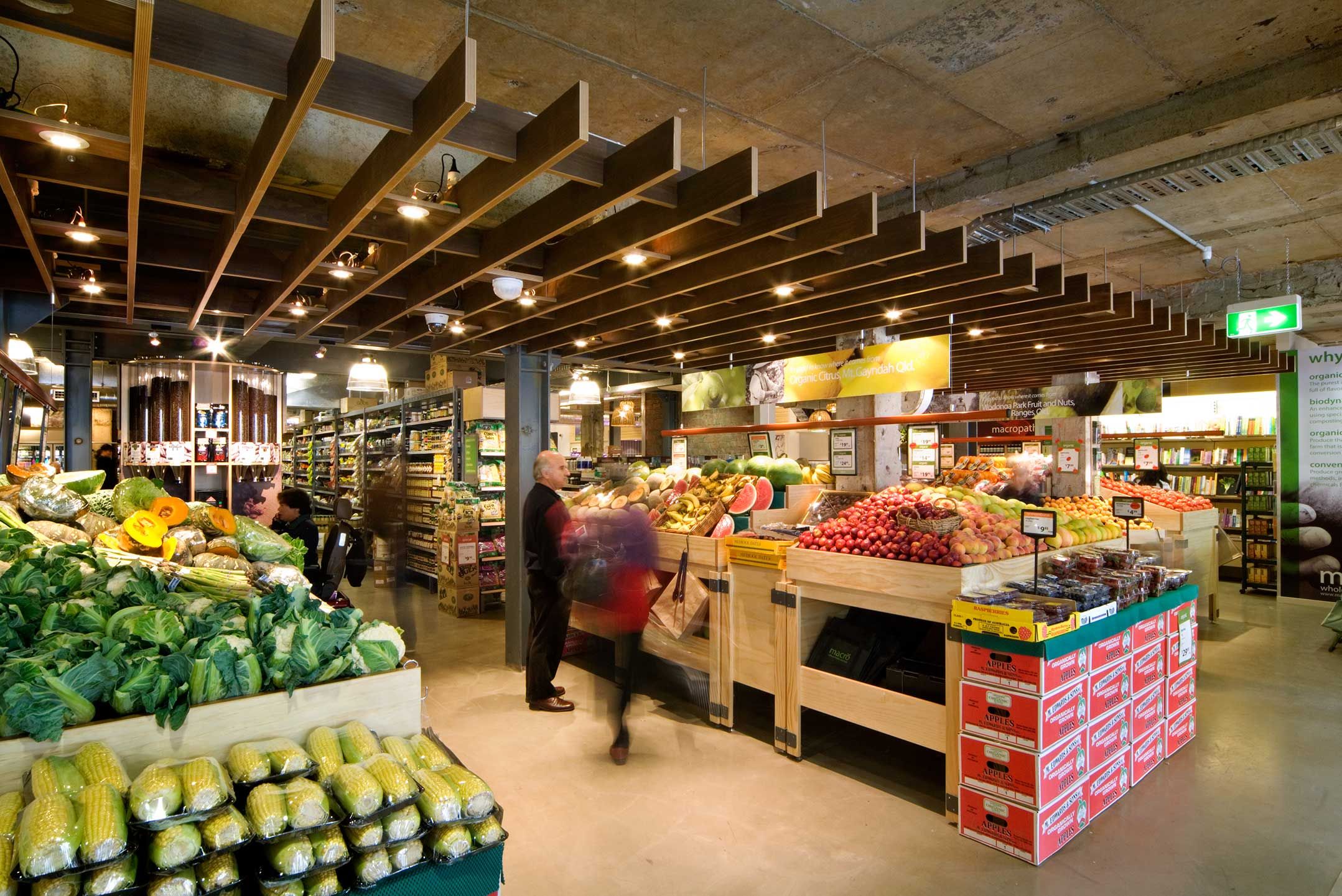
You’ve probably never given much thought to how grocery stores are designed, but every detail, from the layout to the lighting, is strategically planned to create the best shopping experience. Let’s step into the future of food shopping and explore how to design grocery store interiors that are both engaging and efficient.
Food Store Interior Design: A Comprehensive Guide
A well-designed food store can make or break the shopping experience. It’s no longer just about stocking shelves; it’s about creating a space that draws customers in and keeps them coming back.
Crafting a Customer-Centric Space
Think of your store as more than just a place to buy groceries—it’s an experience. How can you, through design, make that experience enjoyable, even delightful?
1. Colors That Pop, Spaces That Breathe
- Color Psychology: Warm, inviting colors like sunshine yellow can make shoppers feel welcome and relaxed, while cool, calming tones can create a sense of spaciousness and order.
- Spacious Layout: Ensure your layout allows for easy movement, with wide aisles and clearly defined sections.
2. Let Your Brand Shine Through Design
Your store’s design is an extension of your brand.
- Reflect Your Identity: Are you a hip, urban market focused on local produce? Use reclaimed wood, exposed brick, and vibrant chalkboard menus. Are you a family-friendly store? Opt for warm lighting, clear signage, and a layout that makes it easy for parents to navigate with kids.
3. Functionality is Key: Think Flow and Accessibility
- Strategic Product Placement: High-demand items should be easy to find, and tempting impulse buys should be strategically placed.
- Flow and Accessibility: Think about how you can guide customers through the store in a way that feels natural and accessible to everyone. Wide aisles, clear signage, and strategically placed baskets all contribute to a positive experience.
4. Setting the Mood with Light
- Natural Light: Natural light is fantastic for showcasing fresh produce and creating a welcoming vibe.
- Artificial Light: Strategically use artificial light to highlight certain areas, create a sense of drama, and even influence customer behavior. Think about the warm, inviting glow of the bakery section versus the brighter, more functional lighting in the dairy aisle.
5. Embracing the Power of Technology
- Digital Signage: Display daily specials, promote new products, or even offer recipe ideas based on nearby items.
- Interactive Kiosks: Help customers locate specific products, provide nutritional information, or even offer personalized recommendations.
6. Engaging the Senses
- A Feast for the Senses: The subtle aroma of freshly baked bread, the gentle hum of ambient music, the cool touch of a perfectly ripe melon – these sensory details create a memorable experience and subtly encourage purchases.
Key Points of Food Store Interior Design:
- Customer-Centric Focus: Create a welcoming atmosphere with inviting colors, ample space, and easy navigation.
- Brand Expression: Align store design with brand personality through colors, signage, and overall aesthetics.
- Functionality and Accessibility: Ensure seamless product placement, smooth traffic flow, and accessible features for all shoppers.
- Lighting: Utilize natural and artificial light to showcase products, create ambiance, and influence behavior.
- Technology Integration: Leverage digital signage and interactive kiosks to enhance the shopping experience and provide personalized assistance.
- Sensory Engagement: Engage customers’ senses through appealing aromas, ambient music, and tactile experiences that complement the products and brand.
How Does Lighting Affect Food Store Interior Design?
Lighting plays a huge role in setting the mood and drawing customers in. Let’s dive into how different types of lighting can make your grocery store a hit.
Setting the Mood
- Warm and Inviting vs. Sleek and Modern: Just like in a restaurant, the right lighting can make your grocery store feel warm and welcoming or sleek and modern. Soft, warm lighting encourages customers to browse, while brighter, cooler lighting can make them feel more alert and focused.
Making Shopping Easier with Task Lighting
- Clear Visibility: Good task lighting is crucial for helping your customers see clearly. Use brighter lights in areas where people need to be able to read labels, find specific items, and check out.
The Psychology of Food and Lighting
- Appetite Appeal: Warm lighting tends to make food appear more appetizing. By strategically using warm lighting in your produce section or bakery, you can subtly enhance the natural colors and textures of the food.
Reflecting Your Brand Through Lighting
- Lighting and Brand Personality: Do you want your store to feel traditional and familiar? Warm lighting might be the way to go. Are you going for a modern, health-conscious vibe? Brighter, cooler lighting could be a better fit.
Keeping it Sustainable and Employee-Friendly
- Energy Efficiency: Energy-efficient lighting not only saves you money but also shows your customers that you care about the environment.
- Employee Comfort: Good lighting design should minimize glare and create a comfortable working environment, which can boost morale and productivity.
Citation: The Impact of Lighting on Food Store Interior Design
Key Takeaways
- Lighting and Ambiance: Different types of lighting evoke specific emotions and perceptions, influencing customers’ moods and dining experiences.
- Task Lighting for Functionality: Adequate task lighting ensures clear visibility for practical activities, such as reading menus or seeing food clearly, enhancing the overall dining experience.
- Lighting’s Influence on Food Perception: Lighting can influence how appetizing food appears, with warm lighting generally making food look more appealing.
- Psychology-Driven Design: Understanding customer psychology helps designers create restaurant interiors that align with brand aesthetics and target demographics.
What Is Space Optimization In Food Store Interior Design?
Space optimization is like a magic trick that makes your store feel bigger, brighter, and more inviting.
- Visual Expansion: Big windows let natural light flood in, while mirrors strategically placed around the store bounce light around, making the space feel larger than it actually is.
- Multifunctional Furniture: Imagine a display table that doubles as a cozy spot for customers to take a break or a checkout counter with hidden storage underneath.
- Utilizing Vertical Space: Installing shelves that reach for the sky lets you showcase more products without sacrificing precious floor space. You can even get creative with hanging displays to draw the eye upward and add visual interest.
- Seamless Customer Flow: Wide aisles, clear signage, and strategically placed products all contribute to a smooth and enjoyable experience, encouraging shoppers to linger and explore.
- Sensory Engagement: Think about the warm and inviting glow of well-placed lighting, the mouthwatering aromas wafting from the bakery section, or the vibrant colors of fresh produce artfully arranged.
Key Takeaways
- Maximize Aesthetics and Functionality: Strategic space optimization enhances the visual appeal and functionality of grocery stores, creating an inviting and immersive shopping experience.
- Sensory Immersion: Engaging sensory elements, such as lighting, colors, and aromas, evoke positive emotions, stimulate purchasing decisions, and enhance the overall store ambiance.
- Effortless Flow and Navigation: Efficient customer flow and clear navigation help shoppers find desired products effortlessly, reducing frustration and encouraging longer shopping durations.
- Sustainability in Design: Integrating sustainable practices and eco-friendly materials in grocery store interior design promotes environmental responsibility and aligns with consumer values.
The Power Of Visual Merchandising: Engaging Customers In Food Stores
Visual merchandising is about using all the elements at your disposal, from the color of the walls to the arrangement of products, to create a specific atmosphere and experience for your customers.
Key Elements of Visual Merchandising:
- Color Psychology: Warm colors like reds and oranges are known for stimulating appetites, while cool colors can be used to create a sense of peace and calm.
- Strategic Lighting: Bright, focused lighting can highlight special displays or new products, while softer lighting can create a cozy and inviting ambiance.
- Focal Points: Our eyes are naturally drawn to anything that stands out. Create eye-catching displays that are impossible to miss.
- Props and Storytelling: Let’s say you’re promoting a local farm-to-table initiative. Using rustic crates, wooden signage, and potted herbs can instantly transport customers to a charming farmer’s market.
- Cleanliness and Organization: A clean, organized store shows customers that you care about their experience.
Benefits of Effective Visual Merchandising:
- Increased Sales: When products are presented well, they’re simply more appealing.
- Enhanced Customer Experience: A well-designed store that’s easy to navigate and pleasing to the eye creates a positive shopping experience.
- Stronger Brand Identity: Consistent use of colors, themes, and even the style of signage helps customers recognize and remember your store.
Tips for Successful Visual Merchandising:
- Know Your Audience: Tailor your visual merchandising to resonate with their tastes and preferences.
- Mix It Up: Use a combination of lighting, color, displays, and even music to create a multi-sensory experience.
- Stay Fresh, Stay Relevant: Keep your visual merchandising fresh and exciting by updating displays regularly, incorporating seasonal themes, and highlighting new products.
Key Takeaways
- Captivating Visuals: Visual merchandising captivates customers, igniting their desire to explore and engage with products.
- Cohesive Shopping Experience: Thoughtful store layout and visual presentation work together to create a cohesive and satisfying shopping experience.
- Sensory Journeys: Innovative visual merchandising strategies transform retail spaces into sensory journeys, elevating the overall customer experience.
- Data-Driven Displays: Understanding consumer behavior empowers visual merchandisers to craft targeted displays that resonate with their target audience and drive sales.
- Kitchen tiling wall: Elevate your kitchen with stylish wall tiles - December 16, 2025
- Gray Kitchen Backsplash Tile: Ideas for a Stylish Upgrade - December 14, 2025
- Backsplash For Gray Cabinets: Choosing the Right Backsplash Style - December 13, 2025


