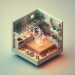
In the world of interior design, playing with opposites is a secret weapon for crafting stunning, high-impact spaces. Get ready to step into a world where bold colors clash with soft hues, vintage pieces dance with modern accents, and nature’s curves mingle with geometric lines. Let’s explore how mixing and matching opposites can turn your home into a captivating symphony of style and personality.
Opposition in Interior Design: Where Clashing Styles Create Harmony
Ever walked into a room and felt instantly captivated? Like something exciting was about to happen? That, my friend, could be the power of opposition at work. It’s not about throwing random things together but about using contrast in a thoughtful way to make your space sing.
Think of it like a delicious recipe. A pinch of salt enhances the sweetness of the cake, right? In design, we do something similar. We pair things that are different—think smooth against rough, dark against light, modern furniture with vintage finds—to create a dynamic tension that makes your space visually pop.
Let’s Talk Contrasts:
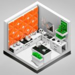
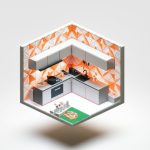
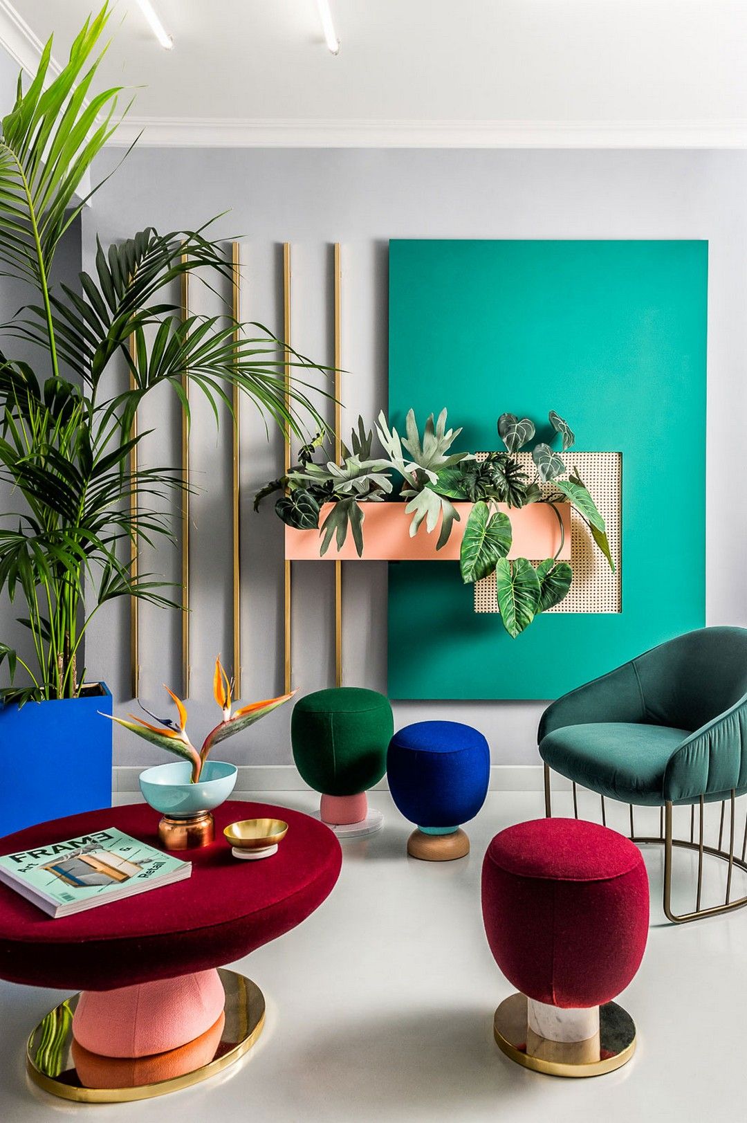
- Color Play: Imagine a bold, emerald green wall acting as a vibrant backdrop for a cluster of sleek, white furniture. The contrast is striking!
- Texture Talk: Picture a plush, velvet sofa nestled against a rustic, exposed brick wall. See how the textures play off each other?
- Shape Shifters: A room full of squares and rectangles gets a jolt of personality with a round coffee table or a curved armchair.
- Big vs. Small: A giant, statement chandelier over a small dining table adds drama and unexpected charm.
This dance between opposites isn’t just about creating a visual spectacle (though it does that brilliantly). Using opposition also:
- Guides Your Eye: It’s like a silent director, telling your eyes where to look first, second, and third, creating a natural flow through the room.
- Highlights Your Favorites: That stunning antique mirror you adore? Give it center stage by surrounding it with minimalist decor. The contrast will make it shine even brighter.
Finding the Balance:
Now, before you go wild with contrasting everything, remember it’s all about balance. Too much opposition can feel chaotic. The key is to:
- Start Small: Introduce contrast gradually—maybe start with throw pillows in clashing patterns or a bold piece of artwork against a neutral wall.
- Consider Your Palette: If you’re a fan of neutral colors, introduce pops of contrast with textures and materials.
- Trust Your Gut: The best designs resonate with your personal style. If it feels good, it probably looks good!
Opposition in interior design is like a secret weapon. It adds layers of intrigue, tells a story, and transforms your space from ordinary to extraordinary. So, go ahead, embrace the power of contrast and watch your design dreams come to life.
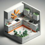
Exploring the Elements of Opposition
Color
Color is one of the most powerful tools for creating opposition in interior design. By strategically using contrasting colors, you can completely transform the look and feel of a space. Here are a few ways to play with color opposition:
- Monochromatic Harmony: This involves using different shades of the same color. For example, you could paint a room in various shades of blue, from a pale sky blue to a deep navy. This creates a sense of peace and elegance.
- Complementary Contrast: This involves using colors that are opposite each other on the color wheel, such as red and green or blue and orange. Complementary contrast creates a bold, energetic feel.
- Analogous Contrast: This involves using colors that are next to each other on the color wheel, such as blue, blue-green, and green. Analogous contrast creates a sense of harmony and flow.
Shape
The shapes within a space can also be used to create opposition and visual interest. For instance:
- Angular vs. Curved: Pairing furniture and decor with sharp angles alongside pieces with softer, rounded edges creates a dynamic contrast.
- Geometric vs. Organic: Incorporating both geometric patterns (think stripes, chevrons, and plaids) and organic shapes (like florals and botanical prints) brings visual balance.
Texture
Texture plays a crucial role in interior design, adding another layer of depth and complexity. Here’s how to use it to your advantage:
- Rough vs. Smooth: Combining textures like a rough-hewn wooden coffee table with a plush, velvet sofa creates a tactile and visually appealing contrast.
- Matte vs. Glossy: Incorporating both matte and glossy finishes can add another dimension to your design. For example, pairing matte walls with glossy furniture creates a sense of sophistication.
Key Points of Opposition in Interior Design
- Creating Contrast: By pairing things that are different (smooth vs. rough, dark vs. light), a dynamic tension is created that makes a space visually appealing.
- Contrasts in Color: Bold colors can create a vibrant backdrop for sleek, neutral furniture.
- Texture Contrast: Soft fabrics can be offset by rough textures like exposed brick walls.
- Shape Variation: Round or curved elements break up rooms with square and rectangular shapes.
- Size Contrast: A statement chandelier over a small table adds drama and charm.
- Visual Guidance: Opposition directs the eye through a room, creating a natural flow.
- Highlighting Focal Points: Contrasting elements draw attention to key pieces or designs.
- Balance: Too much contrast can lead to chaos; start small and consider how contrasts impact the overall palette.
- Personal Style: The best designs resonate with personal style and should feel visually pleasing.
- Intrigue and Storytelling: Opposition adds layers of interest and transforms spaces from ordinary to extraordinary.
Repetition and Opposition: Working Together
While opposition thrives on contrast, repetition introduces a sense of harmony and flow. By incorporating repeating elements—such as a specific color, pattern, or shape—throughout a space, you create a sense of unity and cohesion.
The key is to strike a balance between repetition and opposition. Too much repetition can make a space feel monotonous, while too much opposition can be overwhelming. When used effectively, however, these two principles complement each other beautifully.
Transform Your Space with Opposition
Ready to infuse your home with a captivating blend of contrasts? Embrace these key takeaways:
- Don’t be afraid to experiment: Play with different combinations of colors, textures, shapes, and sizes to discover what speaks to your personal style.
- Start small and build gradually: Begin by incorporating contrast in subtle ways, like adding a few throw pillows in a bold pattern. As you become more comfortable, you can start experimenting with bolder contrasts.
- Trust your instincts: The most important thing is to create a space that you love. If it feels good to you, it probably looks good, too!
Opposition in interior design is all about creating a space that is both visually stunning and uniquely your own. So, go ahead, embrace the art of contrast and watch your design vision come to life.
Immerse yourself in a harmonious blend of rustic charm and modern elegance with our mountain modern interior design style guide. Step into the realm of musical creativity and discover the essential elements of a music studio interior design. For those seeking design inspiration in the heart of California’s wine country, explore our curated selection of Napa interior designers. Enhance your understanding of professional credentials with our in-depth analysis of the National Council for Interior Design Qualifications.

- Seal for butcher block: Find the best food-safe finish - December 29, 2025
- Finishes For Butcher Block Counters: Choosing The Right Food-Safe Option - December 28, 2025
- Kitchen Countertop Ideas: Find the Perfect Surface for You - December 27, 2025