Imagine your house number transformed into a visual masterpiece, a statement piece that speaks volumes about your home before guests even step inside. The secret ingredient? Font design! Choosing the right font for your home’s name plate can completely transform your entrance, setting the tone for a warm and inviting welcome. Let’s dive into the world of typography and discover the perfect font to complement your home’s personality and captivate every visitor.
Home Name Plate Font Design: Making a Statement
Picking the right font for your home’s name plate is more than just a small detail; it’s about creating a visual identity for your home. It’s like selecting the perfect outfit – you want it to reflect your unique style and personality.
Matching Your Home’s Vibe
Before you fall in love with a fancy script or a bold sans-serif, take a moment to consider the overall aesthetic of your home.
- Traditional Homes: Classic serif fonts, like Times New Roman or Georgia, exude elegance and sophistication, making them the perfect complement to traditional architecture.
- Modern Homes: For a sleek and contemporary feel, opt for clean and simple sans-serif fonts such as Arial or Helvetica.
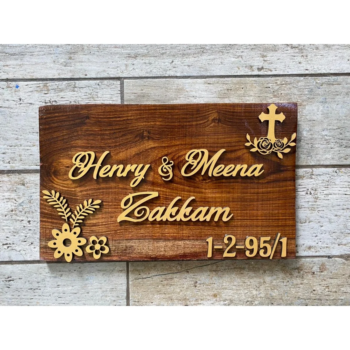
- Charming Cottages: Add a touch of whimsy to your cottage with a playful script font like Edwardian Script or Pacifico.
Readability is Key
While style is important, functionality is paramount. Your home’s name and number need to be easily visible and legible from the street.
- Font Size: Choose a font size that’s big enough to see from a distance but doesn’t overpower the name plate.
- Contrast: Ensure sufficient contrast between the font color and the background color. A dark font on a light background (or vice versa) maximizes readability.
Showcasing Your Style
This is where you can truly personalize! Let your home’s name plate reflect your unique taste and style.
- Cursive Fonts: Inject a sense of sophistication and elegance.
- Bold Fonts: Make a powerful statement and draw attention.
- Playful Fonts: Create a welcoming and whimsical atmosphere.
Boosting Your Curb Appeal
Believe it or not, a thoughtfully chosen font can do wonders for your curb appeal. Just like you wouldn’t wear a tuxedo to a casual gathering, you want a font that гармонично complements your home’s exterior design, landscaping, and overall aesthetic. The goal is to create a visually appealing and cohesive entrance that makes a lasting first impression
DIY Fun
Feeling crafty? Designing your own home name plate is a fun and rewarding way to add a personal touch to your home’s exterior.
- Online Resources: Numerous online resources and software programs allow you to experiment with different fonts, layouts, and designs.
- Material Selection: Once you’ve finalized your design, you can choose from a variety of materials such as wood, metal, acrylic, or even stone. Be sure to select materials that are durable enough to withstand the elements and complement your chosen font style.
- Explore our latest home concept and envision your dream home coming to life. Delve into the details of exterior post-construction to ensure your home’s curb appeal and longevity. Uncover the potential value of your 1200-square-foot home by checking out our insights on the value of 1200 square feet.
What Makes a Home Name Plate Font Design Great?
A well-designed home name plate font doesn’t just look good; it makes a statement. Here are the key elements that contribute to a winning design:
- Match the Vibe: The font should reflect your personal style and complement the overall feel of your home.
- Clear & Concise: Readability is paramount. Choose a font style and size that can be easily read from a distance.
- Elegance is Key: Opt for a font that exudes sophistication and refinement, enhancing the overall aesthetic of your home.
- Custom Creations: Consider a personalized font that incorporates unique elements of your home, such as its name or architectural details.
- Architectural Harmony: The font should complement the architectural style of your home, creating a sense of visual balance and harmony.
Key Points to Remember:
- Fonts for a House Name Plate: The Art of First Impressions: Your choice of typography can make your house name plate stand out and create a welcoming first impression. Consider a handwritten or custom font for a personal touch.
- Legibility and Elegance: Essential Font Qualities for House Name Plates: Ensure the chosen font is legible from a distance and complements the overall design of the name plate. Elegant fonts add a touch of sophistication to your home’s exterior.
- Custom Fonts: Reflecting Home’s Personality in Typography: Custom fonts allow you to incorporate unique elements, such as your home’s name or architectural features, into the design. This creates a one-of-a-kind name plate that truly reflects your personality and style.
- Matching Font to Architectural Style: Enhancing Home’s Aesthetic: Consider the architectural style of your home when choosing a font. Modern homes often pair well with clean sans-serif fonts, while traditional homes may suit classic serif fonts.
Choosing the Right Font Style For Your Home
Now for the exciting part – choosing the perfect font for your home’s name plate. Think of it as an opportunity to showcase your home’s personality and make a statement.
Font Styles and Their Impact:
- Traditional Serif Fonts (e.g., Times New Roman, Georgia, Garamond): These fonts evoke a sense of classic elegance and tradition, making them well-suited for homes with a more formal or historical aesthetic.
- Modern Sans-serif Fonts (e.g., Arial, Helvetica, Futura): With their clean lines and minimalist design, sans-serif fonts are perfect for contemporary homes that embrace simplicity and functionality.
- Formal Script Fonts (e.g., Edwardian Script, Vivaldi, Zapfino): Script fonts mimic elegant handwriting, adding a touch of sophistication, grace, and formality to your home’s entrance.
- Casual Handwritten Fonts (e.g., Pacifico, Lobster, Comic Sans – use sparingly): For a more relaxed and inviting feel, consider a handwritten-style font. These fonts can add a touch of warmth, personality, and whimsy. However, use casual fonts with caution as they can sometimes impact readability.
Matching Font Style to Architectural Style
Just like you wouldn’t pair a delicate floral dress with chunky combat boots, you want to choose a font that complements your home’s architectural style.
- Victorian Homes: An ornate and decorative font would be a stunning choice to complement the intricate details of a Victorian home.
- Mid-Century Modern Homes: A streamlined minimalist font would enhance the clean lines and geometric shapes characteristic of a mid-century modern home.
- Rustic Homes: A bold, easy-to-read font would look striking on a rustic wooden sign, while a sleek metal sign could handle a more delicate font choice.
Remember: Don’t be afraid to experiment! There are countless free online font libraries (like Google Fonts and Adobe Fonts) where you can browse different styles and find the perfect match for your home.
Key Points to Consider:
- Font selection is crucial: It conveys your home’s style and individuality.
- Complement the aesthetics: Choose fonts that align with the overall ambiance of your home – elegant, welcoming, or inviting.
- Prioritize legibility: Ensure the font is easily readable from a distance, especially for smaller name plates.
- Experiment with styles: Explore classic, modern, script, and handwritten fonts to suit your preferences and the architectural design of your home.
Factors to Consider for Home Name Plate Font Design
Choosing the right font for your home name plate is a design decision that shouldn’t be taken lightly. Here’s a detailed look at the factors to consider:
Finding Your Home’s Font Soulmate
Think of your name plate as your home’s friendly face, extending a warm welcome to guests. The font you choose plays a crucial role in setting the tone right from the start.
- Architectural Harmony: Let your home’s architectural style guide your font choice. A sprawling ranch might welcome a more casual font, while a stately Colonial might call for a more traditional option.
- Cohesive Design: The font should complement the overall design of your home, including the exterior color palette, landscaping, and any existing signage.
Size Matters: Making Sure Your Name Plate Gets Noticed
A stunning font won’t make a difference if no one can read it. Consider these size and visibility factors:
- Distance Legibility: If your house is set back from the street or if the name plate is relatively small, opt for a larger font size to ensure it’s visible from a distance.
- Material Impact: Be mindful that the material of your name plate can affect font visibility. For example, intricate script fonts might be harder to read on heavily textured surfaces.
Color Contrast: Where Readability Meets Style
When it comes to readability, contrast is king.
- High Contrast for Visibility: A stark contrast between the font color and the background color is essential for optimal readability. For example, a dark font on a light background or vice versa.
- Avoid Similar Colors: Steer clear of using colors that are too similar in tone or hue, as this can make the text difficult to distinguish from the background.
Don’t Forget the Rules!
Before you fall head over heels for a specific font or design, it’s wise to check your local regulations.
- Community Guidelines: Some communities have specific guidelines regarding the size, placement, and even the style of fonts permitted on home name plates.
- HOA Restrictions: If you live in a neighborhood governed by a homeowners’ association (HOA), be sure to familiarize yourself with their rules regarding exterior modifications, including signage.
Key Takeaways:
- Choose a font that represents your home: Reflect the style, personality, and architectural features through your font choice.
- Prioritize size, visibility, and material: Ensure easy readability by considering these factors in relation to your chosen font.
- Ensure adequate color contrast: Opt for a high contrast between the font and background for maximum visibility.
- Adhere to local regulations: Comply with community guidelines and HOA restrictions regarding name plate designs.
Unique Insights:
- The Psychology of Fonts: Consider the emotional impact different font styles can have and how they might influence the perception of your home.
- Incorporating Lighting: Enhance the visibility and impact of your home name plate at night by incorporating backlighting or reflective elements.
- 3D Lettering: Add depth and dimension to your name plate by using raised or recessed letters.
- Personalization: Consider a truly custom font that uniquely reflects the personality of the homeowners or incorporates a design element specific to your home.
By carefully considering these factors and embracing your creativity, you can design a home name plate that is not only functional but also a true reflection of your personal style and a welcoming beacon to all who visit.

- The Best Battery Picture Lamps for Effortless Artwork Illumination - April 1, 2025
- Double Sink Bath Vanity Tops: A Buyer’s Guide - April 1, 2025
- Bath Towel Measurements: A Complete Guide to Choosing the Right Size - April 1, 2025