Hey there, color enthusiasts! Ready to brighten up your world with Benjamin Moore’s First Light, the Color of the Year 2020? This soft and feminine shade is like a breath of fresh air, with a touch of rosy charm that’ll make your spaces sing! So, let’s dive into the world of First Light and explore all the ways this versatile hue can transform your home into a haven of tranquility and joy.
Unveiling the Charm of First Light
Remember when Benjamin Moore chose First Light as their Color of the Year back in 2020? Well, this color did way more than just trend for a year. It’s still super popular because it’s this awesome mix of warm, elegant, and happy vibes all in one!
What Makes First Light Special?
First Light is basically a really cool pink. It’s got these subtle gray hints that make it extra special. Think of it as a soft, almost off-white shade when the sun’s shining bright. But when the lights are dimmed, you’ll notice those gorgeous pink tones come out to play. It’s all about calm and peaceful energy with this color – it just makes you feel good!
Where Does First Light Shine?
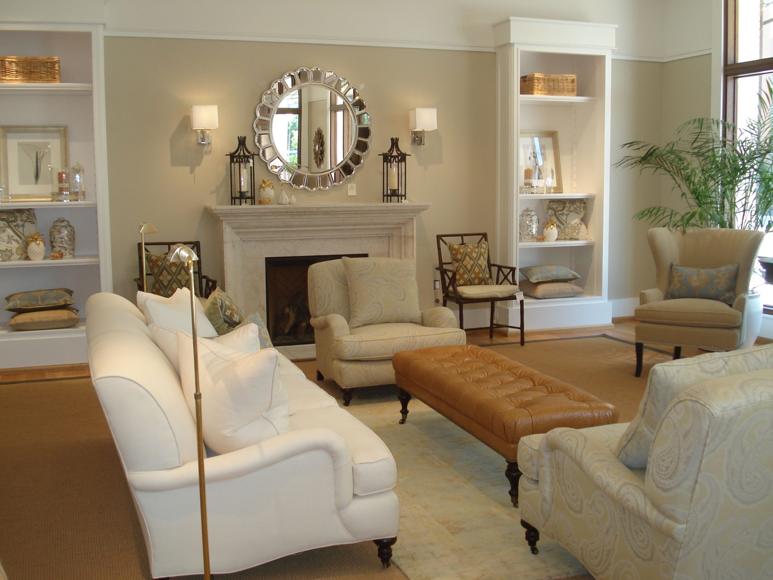
That’s the cool thing about First Light – it’s super versatile! Whether your style is modern and minimalist, cozy farmhouse, or even classic and traditional, this color can totally work for you. And don’t be afraid to mix it up! First Light looks amazing with neutrals like white, gray, and black, but don’t stop there. It also loves hanging out with cool colors like greens, blues, and lavenders, and even gets along with warm tones like golds, yellows, and burnt oranges.
Expert Tips for Using First Light
Here’s a little insider secret: lighting can totally change how a color looks on your walls. That’s why it’s always a good idea to try out a few First Light samples in the room you’re planning to paint. See how it looks at different times of day and with your lights on and off.
- Want to keep things light and airy? Crisp white trim is your new best friend.
- Feeling a little bold? Go for black accents to give your space a modern edge.
- Want to add a touch of glam? Think metallics like gold or copper – they’ll make First Light really shine.
- Craving warmth? Bring in natural textures like wood or linen to create a cozy vibe. For rustic yet modern home decor, explore our battery operated sconces that exude timeless charm and provide ample illumination without the hassle of wiring.
Thinking Beyond Walls with First Light
Don’t limit First Light to just your walls! This color is a rockstar on furniture, cabinets, and even ceilings. It’s not just for bedrooms or nurseries either. First Light has moved beyond those traditional “feminine” associations. It’s all grown up now and brings a sophisticated, gender-neutral look to any space. Transform your bathroom into an elegant oasis with our exquisite bath and beyond drapes that add a touch of sophistication and enhance privacy while allowing natural light to filter through.
Andrea Magno, who’s in charge of color trends at Benjamin Moore, says something really interesting: “When you look back at popular colors throughout history, you often see a connection to what’s happening in the world and how people are feeling.” Think about it – First Light, with its positive and comforting energy, perfectly captures that feeling of a fresh start and hopefulness that we all needed at the beginning of this new decade.
Decoding First Light: Is It Warm or Cool?
So, we’ve already talked a bit about Benjamin Moore’s First Light, but let’s dive into one of the most intriguing questions about this popular paint color: is it warm or cool? The answer, my friend, is not as straightforward as you might think. First Light is a bit of a chameleon, dancing between warm and cool depending on how you use it and how the light hits it.
Here’s the deal: First Light is grounded in a soft, rosy hue, which would typically push it towards the warm side of the color spectrum. But, and this is where things get interesting, it also has these subtle gray and even slightly blue undertones. These undertones act like a balancing act, preventing the color from feeling too overtly warm.
Think of it like this: imagine a sunrise. You have the warmth of the rising sun, but there’s also this cool, crispness to the morning air. That’s kind of what First Light does with color.
This unique blend gives First Light incredible versatility. Place it in a room filled with natural light, or pair it with warmer tones, and its warmer personality shines through. But, surround it with cooler colors or let it bathe in soft, diffused light, and its cooler side emerges. It’s like having two colors in one!
Now, some folks might say that First Light leans slightly more towards the warm side because of its red base. And yeah, that’s a valid point! But remember those gray and blue undertones? They keep things interesting and prevent it from ever feeling too saccharine or overly warm.
What’s truly special about First Light is how it can create different vibes depending on your decor. It’s calm and inviting, making it a great choice for bedrooms and living rooms where you want a relaxed atmosphere. But it’s also got this sophisticated edge, which is why it works so well in dining rooms or even a chic powder room.
The beauty of First Light is that it doesn’t box you in. It’s a color that works in both masculine and feminine spaces, adding a touch of elegance without feeling too over the top. It’s a color that truly adapts to you and your style.
Unmasking First Light: A Closer Look
We’ve already talked about how cool First Light is, but let’s dive a little deeper into what makes this color so special. Imagine a color that sits right on the edge between a warm hug and a cool breeze – that’s First Light. It’s like they took a classic red and gently blended in some soft grays and blues, creating this really versatile neutral that seems to work with almost any other color you can think of.
Designers have described First Light as a “soft kind of wash of blush,” which is a pretty spot-on description. See, it’s not your typical in-your-face pink. It’s much more muted and sophisticated, kind of like a whisper of color instead of a shout. This makes it a fantastic alternative to plain old white because it adds warmth and depth to a room without being too overwhelming.
Speaking of brightening things up, First Light has a light reflectance value (LRV) of 75.86. Now, that might sound like a bunch of technical jargon, but basically, it means that this color reflects a good deal of light. So, it can really make a room feel brighter and more open while still providing enough contrast against white trim.
One of the most interesting things about First Light is how it seems to change depending on the light around it. Natural sunlight might make it feel warmer, almost like a peachy hue, while under artificial light, it can take on a cooler, almost ethereal quality. This chameleon-like ability is what makes First Light so incredibly adaptable. It’s like having a color that can seamlessly blend into any design scheme, whether you’re going for a cozy and warm vibe or a sleek and modern look.
Beyond First Light: Exploring Benjamin Moore’s Most Popular Colors
You’re not alone if you’ve heard whispers about Benjamin Moore paints – they’re a household name for a reason! They’ve earned their reputation for awesome colors and top-notch quality. But with so many shades to choose from, it can feel like a treasure hunt to find ‘the one.’ Let’s break down what makes certain Benjamin Moore colors so popular and spill the tea on some fan favorites.
Why the Benjamin Moore Buzz?
Benjamin Moore isn’t just slapping pretty colors on a palette and calling it a day. They’ve got a whole team of color experts who are like the Sherlock Holmes of design trends. They’re studying what people are loving, what’s hot in the design world, and even the psychology of color. This means they’re not just creating colors you like today, they’re crafting shades that will still feel fresh and fabulous years down the line. Plus, their paint is known for its staying power, so your walls will look amazing for years to come.
The People’s Choice: Benjamin Moore’s All-Star Colors
Ready for the inside scoop on the colors everyone’s buzzing about? Here are some of Benjamin Moore’s heavy hitters:
1. Chantilly Lace OC-65
Imagine a white that’s so fresh and clean, it practically sparkles! That’s Chantilly Lace. It’s like the little black dress of the paint world – timeless, elegant, and it goes with everything. Whether your style is classic or modern, this shade adds a touch of sophistication to any room.
2. White Dove OC-17
If you’re looking for a white that feels like a warm hug, White Dove is your new best friend. It’s got these soft, creamy undertones that make any space feel cozy and inviting. It’s no wonder people are obsessed with using it in living rooms, bedrooms – basically anywhere you want to relax and unwind.
3. Edgecomb Gray HC-173
For those who want a break from stark white, Edgecomb Gray is the ultimate neutral. It’s like the perfect blend of gray and beige (they call it “greige”), giving it this warm, comfy vibe. And the best part? It goes with pretty much any style, so you can’t go wrong.
4. Revere Pewter HC-172
Revere Pewter is like the chameleon of the bunch. It’s a gray that’s not too warm, not too cool – it just works everywhere. It’s the kind of color that lets your furniture and décor shine, adding a touch of understated elegance.
5. Hale Navy HC-154
Don’t let the name fool you – Hale Navy is more than just a color for nautical themes. It’s a deep, rich blue that brings instant sophistication to any room. Whether you use it on an accent wall or go all out, prepare for a serious dose of drama (in the best way possible!).
The Verdict?
Benjamin Moore’s most popular colors aren’t just trendy flashes in the pan – they’re carefully crafted hues that stand the test of time. Whether you’re drawn to the crispness of Chantilly Lace, the cozy warmth of White Dove, or the moody elegance of Hale Navy, one thing’s for sure: Benjamin Moore has a color that’s bound to tickle your fancy.
Key Points on Benjamin Moore First Light:
- Color Description: A warm, elegant, and versatile shade of pink with subtle gray undertones.
- Versatility: Suitable for various styles, from modern to traditional.
- Neutral Pairing: Complements neutrals like whites, grays, and blacks.
- Colorful Compatibility: Harmonizes well with greens, blues, lavenders, golds, yellows, and burnt oranges.
- Lighting Impact: Lighting conditions can alter the appearance of First Light on walls, so test samples in different light scenarios.
- Styling Tips:
- Crisp white trim: Light and airy
- Black accents: Modern edge
- Metallic accents: Glamorous touch
- Natural textures: Cozy vibe
- Beyond Walls: Can be used on furniture, cabinets, and even ceilings.
- Gender-Neutral Appeal: First Light transcends traditional gender associations and adds sophistication to any space.
- Sociocultural Significance: Reflects feelings of hope and renewal during the start of the new decade.

- The Best Battery Picture Lamps for Effortless Artwork Illumination - April 1, 2025
- Double Sink Bath Vanity Tops: A Buyer’s Guide - April 1, 2025
- Bath Towel Measurements: A Complete Guide to Choosing the Right Size - April 1, 2025