This holiday season, treat yourself to a festive surprise with The Body Shop Advent Calendar. Indulge in 24 days of pampering beauty treats, carefully curated to delight your senses and rejuvenate your body and mind!
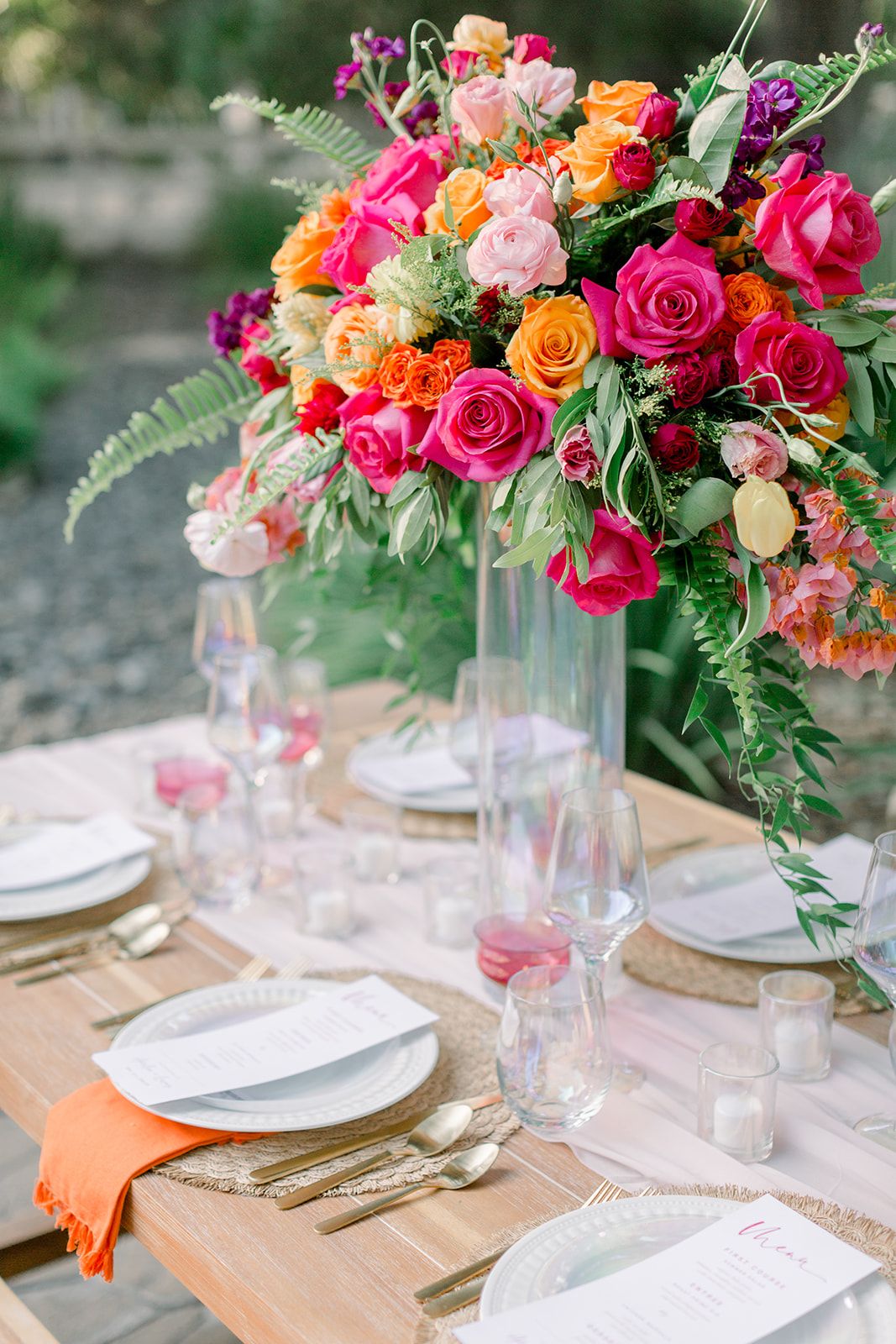
Calling all home décor enthusiasts! Prepare to elevate your living spaces with the strategic use of bold colors. This guide will explore the transformative power of vibrant hues, demonstrating how they can evoke emotions and redefine the atmosphere of your favorite rooms. Learn how to masterfully balance these vibrant shades and create interiors that truly captivate.
Understanding the Power of Bold Color
Bold colors in home décor offer a powerful way to make a statement and inject personality into your living spaces. It’s about understanding how these intense hues can dramatically shift a room’s mood, draw attention to key features, and even tell a story about your personal style.
What Makes a Color “Bold”?
Bold colors stand out due to their high saturation and intensity. They’re the superheroes of the pigment world, packed with chroma and demanding attention.
- Saturation: Bold colors are highly saturated, meaning they are rich and pure, unlike softer pastels or muted shades.
- Intensity: Boldness isn’t solely about brightness. A deep, saturated navy blue can be incredibly bold without being exceptionally bright.
- Impact: The defining characteristic of a bold color is its ability to grab attention and make a statement.
Decorating with Bold Colors: A Balancing Act
The key to successfully incorporating bold colors is balance. The goal is sophistication and impact, not sensory overload. Pairing bold hues with muted companions—whether softer versions of the same color or calming neutrals—creates a harmonious and visually appealing space.
Toning Down Intensity
If a bold color feels too overpowering, it can be tempered by:
- Mixing with Black: Creates shades, resulting in deeper, richer hues.
- Mixing with White: Creates tints, resulting in lighter, softer colors.
- Mixing with Gray: Creates tones, providing a more subdued, sophisticated feel.
- Complementary Colors: Using a color’s opposite on the color wheel (e.g., blue and orange) can surprisingly create a harmonious balance.
- Earthy Tones: Browns, greens, and other earthy tones can ground a bold color, providing a more natural feel.
Strategic Color Placement
Where you use bold colors matters significantly. Consider these strategies:
- Neutral Backdrops: White, gray, or beige walls allow bold furniture or accessories to truly pop.
- Accent Pieces: If you’re hesitant, start small with cushions, throws, artwork, and other accessories.
- Small Spaces: Bold colors can make a small space feel more dynamic and interesting.
- Monochromatic Schemes: Different shades and tints of a single bold color create a sophisticated and cohesive look.
Building a Bold Color Palette
Creating a successful bold color palette involves selecting hues with high saturation and incorporating contrast for visual interest and dynamism. Think of it as assembling a superhero team: each color brings its own strength to the overall composition.
The Psychology of Bold Hues
Colors significantly influence our emotions and perceptions. Red is often associated with excitement, blue with calmness, and yellow with energy. Consider the desired mood for each space. Bold colors naturally draw the eye, making them ideal for highlighting architectural features or favorite furniture pieces.
Going Beyond the Basics
- Cultural Context: Color meanings vary across cultures. Researching these associations can add depth to your design.
- Lighting: Lighting significantly affects how colors appear. Test paint colors in different lighting conditions.
- Accessibility: Ensure sufficient contrast for people with visual impairments.
Diving Deeper into Bold Color
Bold colors—vibrant, saturated shades—command attention and make a statement. They inject personality and energy into a space, evoking a wide range of feelings, from the sophistication of emerald green to the warmth of tangerine.
Why Use Bold Colors?
- Boost Energy: Bold colors energize a space, transforming a bland room into something special.
- Create a Focal Point: They draw the eye and highlight specific areas or features.
- Express Personal Style: Bold colors are a powerful tool for self-expression.
- Enhance Space: Strategically placed bold colors can create the illusion of a larger room.
- Boost Mood: Surrounding yourself with vibrant hues can positively impact your well-being.
Where to Use Bold Colors
Bold colors can work in any room, especially in social spaces like living and dining rooms. Even a small touch in a hallway or entryway can make a big impact.
Choosing the Right Bold Color
Consider these factors when selecting a bold color:
- Desired Vibe: Do you want energy or relaxation?
- Existing Décor: Choose a color that complements your current furnishings and wall colors.
- Natural Light: Rooms with ample natural light can handle more intense shades.
- Room Size: A single accent wall might suffice in a small room, while a larger room could accommodate more.
Research suggests that color responses are personal and influenced by cultural and individual experiences. Trust your instincts and choose what you love. Experiment and have fun!
Decoding Bold Colors: Terminology and Application
Bold colors are the vibrant, attention-grabbing members of the color family. They possess a richness and depth that captivates the eye, creating a powerful visual impact through intensity and saturation. These vivid shades play a crucial role in design, influencing mood, highlighting key elements, and conveying a story. Classic examples like red, orange, yellow, green, blue, and purple all have bold variations. However, it’s the intensity of the hue, not just the name, that determines boldness. A deep sapphire blue is bold, while a pale, washed-out blue is not.
| Color Family | Bold Examples | Less Bold Examples |
|---|---|---|
| Red | Crimson, Scarlet, Fire Engine Red | Pastel Pink, Rose, Salmon |
| Orange | Tangerine, Flame, Pumpkin | Peach, Apricot, Coral |
| Yellow | Canary, Lemon, Goldenrod | Cream, Butter, Pale Yellow |
| Green | Emerald, Kelly Green, Forest Green | Lime, Seafoam, Olive |
| Blue | Sapphire, Cobalt, Royal Blue | Sky Blue, Baby Blue, Powder Blue |
| Purple | Violet, Amethyst, Indigo | Lavender, Lilac, Periwinkle |
Effectively using bold colors involves balancing them like a chef balances flavors. Too much can be overwhelming, while too little diminishes the impact. Strategic use as accents, against a neutral backdrop, creates drama and draws the eye. Contrasting bold colors, such as complementary pairs or triads, can create a dynamic feel, but requires careful execution. Our perception of color is subjective and influenced by cultural context, personal experiences, and trends. Experimentation is key to finding combinations that resonate with you.
The Colors of Confidence: Expressing Boldness Through Hues
Boldness in color comes from vibrant, attention-grabbing shades that radiate energy and make a lasting impression. This intensity is often derived from saturation – the richness and purity of the hue. While red and orange are commonly associated with boldness, other colors, like deep navy or contrasting pairings, offer sophisticated alternatives. The human brain perceives certain colors as inherently bolder due to their high visibility, including yellow, orange, cyan, magenta, lime green, and red. Combining a bold color with a bright contrasting color, like gold or white, amplifies the effect.
Beyond brightness, various colors symbolize boldness:
- Dark Blue/Navy: Strength, masculinity, authority.
- Red: Passion, energy, excitement, sometimes danger.
- Orange: Enthusiasm, creativity, playfulness.
- Yellow: Optimism, joy, intellectual energy.
- Green: Growth, harmony, freshness (especially lime green).
- Purple: Royalty, luxury, wisdom (especially royal purple).
Color symbolism varies across cultures, and context greatly influences perception. Understanding the psychology of bold colors empowers confident self-expression in various fields, from branding to fashion and interior design. Subtle boldness can also be achieved with less saturated colors like deep emerald green, sapphire blue, or burgundy. The key is to strike a balance, using bold colors effectively without overwhelming the senses. Boldness is a spectrum, influenced by shade, saturation, context, and cultural interpretation.
- Dora the Explorer Wipe-Off Fun: Safe & Mess-Free Activities for Little Explorers - April 18, 2025
- Does Lemongrass Repel Mosquitoes? Fact vs. Fiction + How to Use It - April 18, 2025
- Do Woodchucks Climb Trees?Fact vs. Fiction - April 18, 2025


