Purple and green: a surprisingly harmonious pair! This dynamic duo, often found in nature, offers a vibrant contrast that can elevate any design. This guide explores the how and why of combining these colors, from understanding the underlying color theory to practical tips for incorporating them into your home, wardrobe, and more.
Why This Unexpected Pair Works
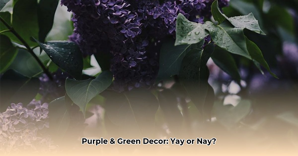
The secret lies in the color wheel. Purple and green are near-complementary colors, sitting nearly opposite each other. This inherent contrast creates visual interest and a sense of balance. Think of a field of violets against lush green grass – nature’s perfect example of this harmonious pairing. This contrast probably makes each color appear more vibrant when placed side-by-side. It’s a classic case of opposites attracting.
Mastering the Mix: Tips and Tricks
Ready to harness the power of purple and green? Here’s how:
Choose Your Dominant Hue
Decide which color takes center stage. A predominantly green room with purple accents creates a different mood than a primarily purple space with green highlights.
Explore the Spectrum of Shades
Think beyond basic purple and green. From delicate lavender and mint to rich amethyst and emerald, the possibilities are vast. Experimenting with different shades unlocks a world of design potential.
Ground with Neutrals
Neutrals like white, gray, or beige provide a visual resting place, preventing the color combination from becoming overwhelming. They act as a backdrop, allowing the vibrancy of purple and green to truly shine.
Consider the Mood
What feeling do you want to evoke? Deep, rich tones suggest drama and luxury, while lighter shades whisper tranquility and peace. The mood is yours to command.
Purple and Green in Action
Let’s see how this dynamic duo works in different contexts:
Interior Design
Imagine a living room with sage green walls, plum-colored throw pillows, and emerald green plants. Or a kitchen with lavender cabinets and countertops with subtle green veining.
Fashion
A flowing lavender dress with a forest green scarf makes a bold yet sophisticated statement. A deep violet blouse with emerald green accessories can be equally striking.
Graphic Design
Purple and green can be surprisingly effective in branding. The combination suggests both creativity and sophistication.
Delving Deeper: Psychology and Culture
Green often symbolizes nature, growth, and tranquility, while purple is associated with royalty, creativity, and magic. Combining these colors can create a space that feels both grounded and inspiring. Color perception can vary across cultures, adding another layer of intrigue.
Your Purple and Green Cheat Sheet
| Purple Shade | Green Shade | Mood/Style |
|---|---|---|
| Lavender (#E6E6FA) | Sage Green (#B7C3BC) | Serene, Calming |
| Amethyst (#9966CC) | Olive Green (#808000) | Rich, Luxurious |
| Violet (#8F00FF) | Emerald Green (#50C878) | Vibrant, Modern |
| Plum (#DDA0DD) | Teal (#008080) | Dramatic, Sophisticated |
Expanding Your Palette
Want to add more depth? Consider incorporating a third color. Warm peach can soften the contrast, while crisp white adds a modern touch. Metallic accents like gold or silver, especially with deeper shades of purple and green, can introduce a touch of glamour. Blue can create a harmonious triad, bridging the gap between purple and green on the color wheel.
The Role of Undertones
Understanding undertones is key to a harmonious blend. Warm purples (with red hints) pair well with warm greens (yellow undertones). Cool purples (blue undertones) work best with cool greens.
The 60-30-10 Rule
This design principle offers a balanced approach: 60% dominant color (e.g., eggplant purple), 30% secondary color (sage green), and 10% accent color (gold, white, or even coral). It provides a framework for creating a visually appealing composition.
Adding Depth and Intrigue
Varying color saturation prevents visual fatigue. Pair a vibrant emerald green with a soft lavender for a balanced look. Experiment and evaluate the overall effect. Does the room feel harmonious? If not, adjust and tweak until it feels right.
Color Psychology and Personal Preference
Ongoing research suggests that color impacts our moods and perceptions. While some studies link green to concentration and stress reduction, individual responses to color can be deeply personal. Trust your intuition and choose colors that resonate with you.
This guide provides a starting point. Don’t be afraid to experiment, explore, and let your creativity bloom! The dynamic world of purple and green offers endless design possibilities.

- Dora the Explorer Wipe-Off Fun: Safe & Mess-Free Activities for Little Explorers - April 18, 2025
- Does Lemongrass Repel Mosquitoes? Fact vs. Fiction + How to Use It - April 18, 2025
- Do Woodchucks Climb Trees?Fact vs. Fiction - April 18, 2025