This warm and welcoming white, Alabaster by Benjamin Moore, is a popular choice for homeowners and designers alike. This comprehensive guide explores its nuances, benefits, and provides expert tips for incorporating it into your home.
Why Choose Alabaster: Unveiling Its Charm
Alabaster by Benjamin Moore isn’t just any white; it’s a warm, luminous shade that adds a touch of sunshine and a hint of blush to any space.
One of its key features is its high Light Reflectance Value (LRV), which means it reflects a significant amount of light, making rooms feel larger and brighter. But beyond the science, Alabaster evokes a sense of peace and warmth, creating a serene and inviting atmosphere.
The Secret Language of Undertones
Alabaster’s magic lies in its delicate dance of yellow and pink undertones. The yellow brings a touch of warmth, while the pink adds a hint of sweetness. This unique blend creates a chameleon-like quality, allowing Alabaster to adapt to different lighting and surrounding colors.
Depending on these factors, Alabaster might have moments of looking slightly creamy or even a tad beige, making it incredibly versatile for various styles and spaces.
Alabaster in Action: From Walls to Trim
Alabaster’s versatility shines through in its ability to elevate a range of surfaces, from walls and trim to cabinets and furniture. Here are a few ideas to inspire you:
- Bedrooms and Living Rooms: Alabaster’s warmth creates a cozy and relaxing atmosphere, making it perfect for spaces dedicated to rest and rejuvenation.
- Kitchens and Bathrooms: Don’t let its warmth fool you; Alabaster also brings a touch of elegance to kitchens and bathrooms, providing a clean backdrop without feeling sterile.
A Harmonious Palette: Pairing Alabaster with Other Colors
Alabaster’s adaptability extends to its color pairings. It harmonizes beautifully with:
- Natural Elements: Earthy tones, wood finishes, and pops of greenery complement Alabaster’s warmth, creating a natural and organic feel.
- Cool and Collected: Combine Alabaster with blues and grays for a calm and sophisticated vibe. The warmth of the white balances the coolness of these hues, creating a serene and balanced space.
Alabaster vs. The Competition: Navigating Similar Shades
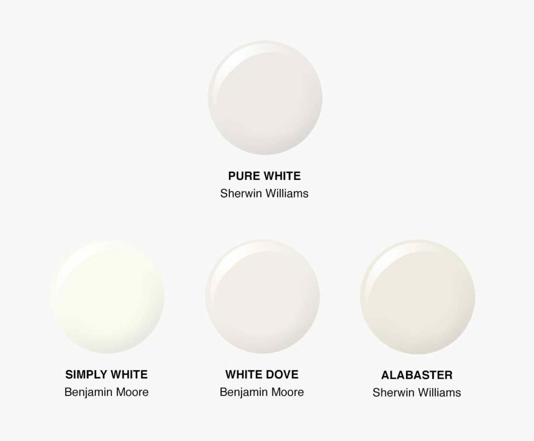
While Benjamin Moore’s Alabaster is a popular choice, you might come across similarly named paints from other brands like Sherwin Williams. It’s important to note that while they share a name, their undertones and overall appearance may differ.
Benjamin Moore Alabaster vs. Sherwin Williams Alabaster
The Sherwin Williams Alabaster tends to have a stronger gray-beige presence compared to Benjamin Moore’s version, which generally retains a softer, rosier feel.
Finding the Perfect Match: A Note on White Dove
Many consider Benjamin Moore’s White Dove as a close counterpart to Alabaster. However, White Dove sometimes leans more towards yellow or even green, especially under cooler LED lighting.
Ultimately, the best way to decide between these popular shades is to grab samples of each and observe how they look on your walls at different times of day. Remember, lighting plays a crucial role in how paint colors appear!
Making Alabaster Sing: Expert Tips for Success
Ready to embrace the beauty of Alabaster? Here are a few expert tips to help you make the most of this beloved hue:
- Light and Samples: Lighting is crucial when choosing paint colors. Alabaster can look different depending on the time of day and the type of light in a room. Always test samples on your walls and observe how the color changes throughout the day before making a final decision.
- Sheen Selection: Paint sheen refers to its level of glossiness and impacts how the color is perceived. Eggshell or satin finishes are popular choices for walls, providing a soft and subtle luster. On the other hand, semi-gloss or gloss finishes work well for trim, adding a touch of shine and durability.
- Color Wheel Harmony: When in doubt about color combinations, consult the color wheel! This designer’s secret weapon helps you create harmonious palettes by understanding the relationships between different hues.
Alabaster: Embracing the Subjectivity of Color
Remember, everyone perceives color differently. What appears warm and inviting to one person might look slightly different to another. Some find that in certain lighting, Alabaster might lean a tad more yellow for their liking. The key is to trust your instincts and choose what feels right for you and your home.
Outperforming the Competition: Alabaster Undertones Explained
When searching online for Alabaster’s undertones, you’ll find a wealth of information. However, we aim to provide even greater value and insight in this comprehensive guide:
Recommended Titles (Targeting User Intent):
- Benjamin Moore Alabaster: Unmasking the Undertones (With Comparisons!) – This title uses engaging language, promises a comparison, and targets a common user query.
- Alabaster vs. White Dove: Deciphering the Perfect White for Your Home – This title directly compares Alabaster with a top competitor, appealing to a specific audience.
- Is Benjamin Moore Alabaster REALLY White? A Deep Dive into Its Undertones and How They Impact Your Design – This title directly addresses a common question and promises an in-depth analysis.
- Beyond Beige: Exploring the Unique Undertones of Benjamin Moore Alabaster – This title highlights the complexity of Alabaster, moving beyond basic descriptions.
Powerful Key Lines (Capturing Attention & Delivering Value):
- Forget stark, sterile white – Alabaster’s subtle pink undertones create a sophisticated backdrop for any space, adding warmth and dimension. – This line contrasts Alabaster with less desirable whites and highlights its key feature.
- Don’t be fooled by online swatches! We’ll analyze REAL photos and expert opinions to reveal how Alabaster’s undertones translate in different lighting conditions. – This statement addresses a common paint-matching pain point and promises tangible, visual guidance.
- The secret to Alabaster’s versatility lies in its elusive rosy glow. Unlike other warm whites that can skew yellow, Alabaster whispers hints of pink, adding a touch of elegance and depth. – This line highlights Alabaster’s unique qualities and positions it as a superior choice.
- From modern farmhouse to minimalist chic, learn how to leverage Alabaster’s unique warmth and pair it with complementary colors for stunning interior design results. – This statement appeals to a variety of design aesthetics and promises practical tips.
Structured Context for Enhanced Clarity:
I. Introduction:
- Start by addressing the reader’s need for understanding paint undertones and how they impact a room’s overall feel.
- Introduce Benjamin Moore Alabaster and briefly mention its popularity and versatility.
- Clearly state the article’s purpose: “This article delves into the undertones of Benjamin Moore Alabaster, providing a comprehensive analysis to help you determine if it’s the right choice for your space.”
II. Decoding Alabaster’s Undertones:
- Primary undertone: Clearly state that Alabaster has a delicate pink (or rosy) undertone, which contributes to its warmth.
- Impact of lighting: Explain how the pink undertone can appear more prominent in warm lighting conditions and more subdued in cooler lighting. Provide specific examples using layman’s terms (e.g., “Imagine sunlight streaming through a window…”).
- Comparison with other whites: Discuss how Alabaster’s pink undertones prevent it from feeling too creamy or yellowed, unlike some warm whites that lean heavily into those tones.
III. Addressing Common Comparisons:
- Alabaster vs. White Dove: Dedicate a section to comparing these popular choices.
- Alabaster vs. Sherwin Williams Alabaster: Briefly touch upon the differences between these similarly named paints.
IV. Alabaster in Different Rooms:
- Move beyond simply stating where Alabaster can be used.
- Provide specific examples of how its undertones interact with different room elements:
- Living Rooms: “Alabaster’s warmth creates an inviting atmosphere and pairs well with earth tones like terra cotta and rust, enhancing the natural elements in your space.”
- Bedrooms: “The subtle rosy hue adds a touch of serenity and complements cooler grays and blacks for a balanced and calming look.”
- Kitchens: “Alabaster’s warm undertones prevent a sterile feel often associated with all-white kitchens. Pair it with natural wood tones and black accents for a classic and inviting space.”
V. Design Tips & Tricks:
- Complementary Colors: Go beyond simply listing colors. Provide specific examples and explain why these pairings work: “Alabaster’s warmth harmonizes beautifully with cool blues and greens, creating a sense of balance and tranquility. For a bolder look, incorporate pops of navy or charcoal gray to create a dramatic contrast.”
- Creating Contrast: Explain how to prevent a washed-out look: “Incorporate contrasting elements like dark furniture, bold artwork, or metallic accents to add depth and visual interest.”
- Testing Alabaster: Provide actionable advice: “Always test paint colors in your specific space and lighting conditions before committing to a final decision. Paint large swatches on your walls and observe how they look throughout the day, as natural light changes.”
VI. Conclusion:
- Summarize Alabaster’s key features: “Alabaster’s unique rosy glow makes it a top contender for homeowners seeking a sophisticated and timeless look. Its versatility, warmth, and ability to adapt to different lighting conditions make it a perfect choice for creating inviting and stylish spaces.”
- End with a strong call to action: “Now that you understand the nuances of Alabaster, grab your samples, experiment, and let this timeless hue transform your home.”
Unique Insights & Untapped Potential:
- Incorporate Visuals: Showcase Alabaster in real-life settings with different lighting conditions using high-quality images.
- Address Common Concerns: Discuss potential drawbacks, such as Alabaster highlighting imperfections on uneven walls, and offer solutions.
- Include User-Generated Content: Feature testimonials or examples of how homeowners have used Alabaster.
- Target DIY Enthusiasts: Provide practical advice on painting with Alabaster, including tips for a smooth finish and choosing the right sheen.
By following this comprehensive approach, you’ll create an SEO-optimized article that not only provides valuable information about Alabaster but also engages your audience and establishes you as a trusted resource.

- How to Get Rid of Mushrooms in Your Lawn: A Complete Guide - April 24, 2025
- How to Get Rid of Ground Hornets: A Safe and Effective Guide to Eliminating Nests - April 24, 2025
- How to Get Rid of German Roaches Fast: DIY Methods for Quick Control - April 24, 2025