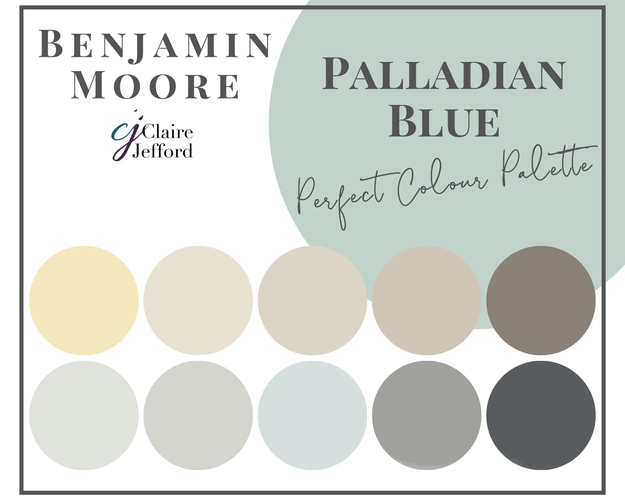
Thinking of infusing your home with a sophisticated, airy hue? Benjamin Moore’s Palladian Blue HC-144 might be your perfect match. More than just a simple blue, this versatile shade boasts a captivating blend of blue, green, and gray, creating a tranquil and ever-changing ambiance. This comprehensive guide dives deep into Palladian Blue, exploring its nuances, applications, and potential, empowering you to use this captivating color confidently in your own home.
Decoding Palladian Blue: Undertones and LRV
Benjamin Moore Palladian Blue HC-144 isn’t your average blue. It’s a whisper-soft blend of blue, green, and gray, shifting and changing with the light, adding depth and intrigue to any space. It strikes that perfect balance – not overly vibrant, not too subdued – making it an ideal choice for creating a serene and stylish atmosphere.
The magic of Palladian Blue lies in its undertones. The prominent green and gray undertones contribute to its cool, sophisticated feel. Understanding its Light Reflectance Value (LRV) is also crucial. Palladian Blue has an LRV of approximately 62, meaning it reflects a moderate amount of light. This contributes to its airy quality, creating a sense of spaciousness while maintaining a calming presence. For more on LRVs, explore our guide on ripe olive sherwin williams, which also has a fascinating LRV.
Palladian Blue in Different Lights: A Chameleon-like Hue
Light is the key to unlocking the true beauty of Palladian Blue. In north-facing rooms, it may appear more subdued, showcasing its calming gray undertones. South-facing rooms, bathed in sunlight, will likely emphasize the refreshing green notes. East- and west-facing rooms offer a dynamic display, showcasing the interplay of blue and gray throughout the day. Even artificial lighting plays a role. Warm incandescent bulbs might emphasize the gray, while cooler LEDs could bring out the blue.
Creating Harmony: Palladian Blue Color Pairings
Choosing the right companions for Palladian Blue can elevate your design.
- Crisp Whites: For trim and accents, crisp whites like Benjamin Moore Simply White (OC-117), Sherwin-Williams Extra White (SW 7006), or Behr Ultra Pure White (PPU18-06) create a classic contrast, allowing the soft blue-green to take center stage.
- Warm Neutrals: Beige and taupe accents introduce a touch of warmth, creating a balanced and inviting atmosphere.
- Deep Charcoals: For a dramatic and sophisticated look, consider pairing Palladian Blue with deep charcoal grays.
- Nature-Inspired Greens: Soft greens, like sage or olive, echo the green undertones of Palladian Blue, creating a harmonious and natural feel.
- Accent Colors: Introduce pops of color with coral, yellow, or soft pinks for a touch of vibrancy and personality.
| Palladian Blue Pairings | Color Code | Why it Works |
|---|---|---|
| Benjamin Moore Simply White | OC-117 | Creates a classic, crisp contrast. |
| Sherwin-Williams Extra White | SW 7006 | A slightly warmer white option. |
| Behr Ultra Pure White | PPU18-06 | A bright, clean white for a modern feel. |
Palladian Blue in Action: Room by Room Inspiration
Palladian Blue’s versatility shines in various settings.
- Bedrooms: Creates a serene and restful sanctuary, promoting relaxation and tranquility.
- Bathrooms: Transforms your bathroom into a spa-like retreat, reminiscent of calming waters and open skies.
- Kitchens: Adds a touch of understated elegance to kitchen walls or cabinetry, especially in spaces with ample natural light.
- Living Rooms: Provides a sophisticated backdrop for both vibrant and neutral furnishings, creating a welcoming and stylish space.
Comparing Similar Hues: Distinguishing Palladian Blue
If you’re exploring similar colors, understanding the nuances is key. While Sherwin-Williams Sea Salt and Benjamin Moore Wythe Blue share a similar tranquil vibe, they possess distinct characteristics. Sea Salt often exhibits stronger green undertones, while Wythe Blue, with its lower LRV, appears darker and more dramatic. Palladian Blue occupies a unique space, delicately balancing blue, green, and gray for a signature airy quality.
The Magic of Metamerism: Embracing the Shift
Palladian Blue exhibits metamerism—the phenomenon of a color appearing different under various light sources. Rather than fighting this, embrace it! This dynamic quality adds depth and visual interest, creating an ever-changing ambiance in your home.
Ongoing Research and Evolving Understandings
Color perception is a complex field. Ongoing research explores how we perceive colors like Palladian Blue. Factors like individual color vision, cultural associations, and surrounding decor influence our experience of color. While LRV provides a numerical measure, the actual perception is subjective. Always test paint colors in your own space under different lighting conditions for the most accurate representation.
Design Styles and Palladian Blue
This versatile hue complements a range of design styles:
- Coastal: Evokes the tranquility of seaside escapes.
- Contemporary: Adds a sophisticated touch to modern spaces.
- Farmhouse: Brings a touch of calming color to rustic settings.
- Transitional: Bridges the gap between traditional and modern aesthetics.
Expert Tips for Using Palladian Blue
- Primer: Using a high-quality primer can significantly enhance the final color and ensure even coverage.
- Sample Boards: Test Palladian Blue on large sample boards in your space to observe how the color changes throughout the day.
- Sheen: Consider the sheen. A matte finish enhances the calming effect, while eggshell or satin offers greater durability and washability.
By understanding the nuances of Benjamin Moore Palladian Blue, you can confidently incorporate this captivating color into your home, creating a space that is both stylish and serene.
- How to Get a Free Mold Inspection (and Avoid the Scams) - April 23, 2025
- How to Flush a Toilet Without Water: A Step-by-Step Guide - April 23, 2025
- The Complete Guide to Safely Disposing of Light Globes - April 23, 2025


