Ready to Transform Your Home with Color?
Choosing the right color for your house is like picking the perfect outfit—it can completely transform its look and feel! It’s about more than just aesthetics; colors can make your home feel warm and inviting or sleek and modern. They can even influence your mood when you walk through the door!
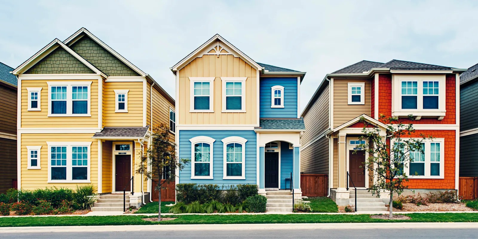
Trending Colors for 2024
This year’s hottest exterior color trends are all about creating a sense of warmth and personality. Think earthy hues like persimmon orange (imagine a sunset on your facade), timeless classics like white, and the modern sophistication of peppercorn gray. For a touch of cheerful warmth, apricot is making a comeback.
If you’re feeling bold, shades of yellow, pink, gray, and green are also gaining popularity—especially when combined with different textures.
Before You Pick Up a Paintbrush…
-
Respect Your Home’s Style: A coastal house calls for a different color palette than a modern apartment. Consider your home’s architectural design and choose colors that enhance its natural beauty.
-
Scope Out the Neighborhood: Take a look at the colors of surrounding homes. The goal is to create a sense of harmony, ensuring your house complements the neighborhood rather than sticking out like a sore thumb.
-
Infuse Your Personality: At the end of the day, your home should reflect you. Choose colors that make you feel happy and at ease.
Unlock a World of Inspiration
Need a little creative boost? Browse photos of houses online, in decorating magazines, or even on paint brand websites, where you’ll often find curated color palettes and inspiring combinations. If you’re feeling overwhelmed, consider consulting an interior designer for expert guidance in creating a harmonious and stylish space.
Beyond Aesthetics: Sustainability and Culture
-
Eco-Friendly Options: More and more eco-friendly paint options are available, offering a sustainable choice for your home and the environment. Some even reflect heat, potentially lowering your energy bills!
-
Cultural Significance: Colors often carry different meanings across cultures. Researching traditional color palettes in your region might surprise you with unexpected inspiration.
Avoid Painter’s Remorse
-
Test, Test, Test: Paint samples are your best friend! Paint small squares on different areas of your exterior walls and observe how they look under varying sunlight throughout the day.
-
Preparation is Key: Clean, dry, and smooth walls are essential for proper paint adhesion and a professional-looking finish.
Which Colors Make a House Look Its Best?
So, you’re ready to paint your home. You’ve probably noticed certain colors are trending this year. For 2024, greens are all the rage—from earthy olive tones to vibrant emerald and calming sage. Neutrals, like pristine white or sophisticated peppercorn gray, continue to be excellent choices for a timeless look. But if you’re looking for something more unique, apricot, sunny yellow, or a subtle pink can give your home a distinctive touch.
But remember, it’s not just about following trends. Your home’s architectural style plays a crucial role in choosing the right colors. For modern homes, neutrals or bold, vibrant colors might be ideal. If your home has a more traditional design, you might prefer a more classic and welcoming palette.
Think about the natural light in your home, too. If your home faces north and doesn’t get a lot of direct sunlight, darker shades can make it feel even gloomier. In this case, light and bright colors that reflect light and add warmth would be more suitable. On the other hand, a south-facing home bathed in sunlight gives you the freedom to experiment with richer, more vibrant shades.
Don’t forget to consider the surrounding environment. Observe neighboring houses and the natural landscape. The idea is to choose a color that blends harmoniously with its surroundings.
Visualize Before You Commit
Struggling to visualize how different colors would look on your house? No worries! Plenty of mobile apps can help, such as “Alba Visualizer” (or “Bruguer Visualizer” in certain regions), “Comex App,” “Sherwin Williams Color Expert,” “Procolor Expert,” or “Valentine Colorit2.” These tools are fantastic because they allow you to “paint” your house virtually, seeing how different colors will look in real-time.
For even more inspiration, check out social media platforms like Facebook, YouTube, TikTok, and Pinterest. Search for posts about interior and exterior color combinations, and you’ll find a wealth of examples and expert advice.
Beyond Aesthetics
Choosing a color is about more than just picking something that looks nice. Colors have the power to affect our moods and create completely different atmospheres. For example, blue is often associated with calmness and serenity, while red is linked to energy and passion. When choosing a color, consider the atmosphere you want to create in each room.
Let’s not forget about the environment. An increasing number of eco-friendly paints are less toxic and more environmentally friendly. Consider these sustainable options; your health and the planet will thank you!
Ultimately, color is personal. The most important thing is to choose colors you truly love and that make you feel comfortable in your own home. Don’t be afraid to experiment and unleash your creativity!
Elevating Elegance: Choosing Colors That Exude Sophistication
When aiming for a look that’s both captivating and timeless, the color you choose for your facade plays a pivotal role. It’s not about chasing fleeting trends, but rather finding a hue that enhances your home’s beauty for years to come. While elegance is subjective, there are certain colors often associated with sophistication and enduring style.
For instance, consider the clean luminosity of classic white, the depth and serenity of a rich navy blue, the modern sensibility of charcoal gray, or the welcoming warmth of “greige,” the ever-popular blend of gray and beige.
But it’s not just about randomly selecting a color from a palette. Your home’s architectural style and its surroundings also influence what shades will look best. Imagine a modern home with clean lines and a minimalist design—it would likely look stunning with a monochromatic palette, pops of vibrant color to highlight specific elements, or even natural materials that add texture and warmth. On the other hand, a more traditional home, with ornate details and a stately air, might be best complemented by colors like white, navy blue, or classic red brick.
The Psychology of Color in Design
Colors don’t just decorate; they convey feelings and emotions. Neutral tones, like white, beige, or light gray, tend to inspire calm and provide a sense of spaciousness and sophistication. They’re also incredibly versatile when it comes to decorating. Darker shades, such as navy blue, bottle green, or dark gray, project elegance, drama, and an air of authority. And then there are the jewel tones—emerald green, sapphire blue, ruby red—that evoke luxury, opulence, and a truly unique style.
Details Matter: Doors, Trim & Landscaping
But it doesn’t end with the facade color. Other seemingly small details can make a world of difference in your home’s overall elegance. The color of your front door, for example, is an excellent opportunity to inject a dose of personality. You might choose a color that contrasts with the facade for a bolder look or one that complements it for a more harmonious feel.
Moldings and other architectural details can also be highlighted with a contrasting color, like white or cream, especially against a dark facade. And let’s not forget the power of nature—a well-maintained garden, with plants and flowers that complement your home’s color palette, can elevate the overall elegance and create a sense of harmony and well-being.
In short, elegance is less about strict rules and more about finding a balance between your personal style, the architecture of your home, and the surrounding environment.
Creating Spaciousness: Colors That Make Your Home Feel Larger
You’ve got the foundation; now it’s time to bring those spaces to life! Imagine wanting your home to feel like a breath of fresh air—open, airy, and full of light. Believe it or not, your wall colors can be your greatest allies in achieving this.
Have you ever noticed how light colors, like white, beige, or even those soft pastel shades, can make a room feel instantly brighter? It’s like they reflect sunlight, creating a sense of spaciousness. These colors are perfect for giving your home a fresh, welcoming look with a touch of elegance.
If you really want to make your house look bigger, try this clever trick: paint the walls and ceiling the same color. It might sound strange, but it creates a fascinating visual effect, tricking the eye into perceiving the space as larger than it actually is. It’s like magic!
This doesn’t mean you have to turn your entire house into a blank canvas. Consider playing with different tones of the same color to add depth and dimension to your walls. For example, you could use a lighter beige for most walls and a slightly darker shade for an accent wall.
Let There Be Light
Speaking of light, don’t underestimate the power of natural light. Open those curtains wide and let the sunshine in! A great trick is to strategically place mirrors, such as opposite windows, to reflect even more light into your home. You’ll be amazed how much brighter and more open everything feels.
But wait, this doesn’t mean you have to say goodbye to color entirely. While light colors are the foundation for visually expanding your home, pops of color are essential to bring life and personality to your spaces. Incorporate vibrant colors through furniture, cushions, curtains, or even decorative accents.
It’s all about finding the right balance between the spaciousness light colors provide and the joy that pops of color bring. Have fun experimenting and creating a home that reflects your style!

- Finishes For Butcher Block Counters: Choosing The Right Food-Safe Option - December 28, 2025
- Kitchen Countertop Ideas: Find the Perfect Surface for You - December 27, 2025
- Stove Backsplash Design: Ideas to Elevate Your Kitchen Style - December 26, 2025