Step into the world of interior design, where the magic of contrast transforms your living spaces into masterpieces. Imagine vibrant hues dancing alongside muted tones, inviting textures mingling with smooth surfaces, and the interplay of light and shadow creating captivating compositions. Dive into the art of contrast and uncover its power to make your home stand out. Get ready to explore the secrets of this design principle and unleash your creativity to create interiors that ignite the senses and leave an unforgettable mark.
Contrast in Interior Design: A Symphony of Opposites
Have you ever walked into a room and felt instantly captivated, like something about the space just worked? Often, the magic you’re feeling is the subtle (or not so subtle!) use of contrast in interior design. It’s not about throwing random colors and textures together—it’s about creating a dynamic interplay that makes a space sing.
Think of it like a delicious meal. You wouldn’t want every bite to taste exactly the same, right? Contrast is what adds those exciting pops of flavor. In design, we achieve this by pairing elements with distinct personalities. It could be a sleek, modern sofa against a backdrop of rustic brick or the smooth coolness of marble juxtaposed with the warmth of natural wood.
Contrast is a balancing act. Too much, and the room feels chaotic; too little, and it falls flat. The key is to find that sweet spot where elements complement and challenge each other in equal measure.
So how do you achieve this elusive balance? Let’s break down the key players:
| Element | Description | Examples |
|---|---|---|
| Light | Plays a vital role in emphasizing other contrasting elements. | Sunlight streaming through a dark hallway, a cluster of pendant lights highlighting a textured wall. |
| Color | Creates visual interest and directs the eye. | A bold accent wall against a neutral backdrop, pops of color in furniture against a monochromatic scheme. |
| Texture | Adds another layer of depth and dimension to a space. | A plush velvet sofa against a rough-hewn coffee table, a smooth marble countertop paired with woven baskets. |
| Form | Refers to the shapes and silhouettes of objects in a room. | Mixing rounded furniture with angular architectural details, incorporating both large and small decorative items. |
By skillfully weaving together these elements, designers can create spaces that are both visually stunning and emotionally resonant. A splash of vibrant color can invigorate, while a soothing monochromatic palette promotes tranquility. The rough texture of exposed brick tells a story, while the sleek lines of modern furniture exude sophistication.
Contrast, in essence, is the language of design. It allows us to tell stories, evoke emotions, and create spaces that truly reflect the unique personalities of those who inhabit them.
What is Contrast in Interior Design?
We’ve touched on various design elements, but let’s delve into one that’s like the spice of the design world: contrast. Think of how a plain white t-shirt really pops when paired with bold, colorful pants—that’s contrast working its magic! In interior design, it’s about creating “oomph” by mixing and matching different elements to make your space visually interesting.
And we’re not just talking about colors, although color is a big player. Imagine a fluffy, faux fur rug against a sleek, hardwood floor—that’s texture contrast, adding another layer of depth. Then there’s scale contrast—think a giant oversized painting on a small wall, suddenly making the room feel grander! And don’t forget about shape contrast—a round mirror over a rectangular fireplace mantel breaks up the monotony and adds visual intrigue.
Why Bother with Contrast?
For starters, it banishes boredom. A room without contrast can feel flat and lifeless, like a song with just one note. Contrast adds those highs and lows, the visual “beats” that make a space exciting. But it’s not just about looks—contrast can make your space feel larger, highlight your favorite pieces, and even set the mood. Want a calm and serene vibe? Subtle contrast is your friend. Craving a space bursting with energy? Crank up the contrast!
Let’s break it down further:
| Type of Contrast | Example | Effect |
|---|---|---|
| Color Contrast | Navy blue sofa against a white wall | Creates a focal point, adds drama |
| Texture Contrast | Chunky knit throw blanket on a leather chair | Adds visual and tactile interest, creates warmth |
| Scale Contrast | Small accent table next to a towering bookshelf | Emphasizes the height of the bookshelf, adds visual balance |
| Shape Contrast | Round dining table surrounded by square-backed chairs | Adds visual interest, breaks up straight lines |
The beauty of contrast is that it’s all about playing with different elements until you achieve a look you love. There’s no right or wrong answer, just endless possibilities!
How to Use Contrast in Interior Design: Color
We’ve discussed how contrast can make your interior design pop, so let’s explore the exciting world of color contrast! It’s like adding spices to your favorite dish—the right mix transforms the flavor.
Think of your room as a blank canvas. Light and dark shades of the same color are your foundation. To make a room feel bigger and airier, lighter shades are your best friend! Need to create a cozy and intimate vibe? Darker shades will do the trick!
But wait, there’s more! Color combinations can completely change how you see the space. Ever heard of complementary colors? These colors sit opposite each other on the color wheel, like blue and orange or red and green. Pairing them creates a powerful contrast that can play tricks on your eyes, making rooms seem taller or wider than they are. It’s like magic!
Imagine a living room painted a calming light blue. Now, picture adding pops of burnt orange through throw pillows, a statement rug, or even a bold piece of artwork. That splash of orange instantly energizes the space. That’s the magic of color contrast! You’ve created a dynamic and visually engaging space without overwhelming the senses.
Texture
Texture isn’t just about how things feel; it’s a secret weapon to make a room pop! Imagine a living room with smooth marble floors, a fluffy shag rug, and a rough-hewn wooden coffee table. See how those different textures make the space more interesting? That’s the magic of texture in interior design!
You wouldn’t want to wear an outfit made entirely of the same fabric, right? It would be bland and boring. The same goes for your home décor. Mixing and matching textures adds depth and dimension, preventing a room from feeling flat or monotonous.
Consider the contrast between a sleek leather sofa and a chunky knit throw blanket or the interplay of a smooth, polished countertop with a rustic, textured backsplash. These pairings create visual intrigue and add a touch of personality to your space.
Don’t be afraid to experiment with different materials and layers. Combining textures like wood, metal, glass, fabric, and stone can create a rich and inviting atmosphere. Play with different scales and patterns too. A large-scale woven tapestry can add a dramatic focal point, while smaller textured accents like throw pillows or ceramics can bring in subtle interest.
Remember, texture is all about creating a sensory experience. It’s about inviting people to touch, feel, and truly connect with the space around them. So go ahead, embrace the power of texture and transform your home into a tactile wonderland!
For those seeking inspiration in specialized design aesthetics, exploring church design interior reveals how contrast fosters spiritual connections within sacred spaces. From traditional to modern, these interiors utilize contrast to inspire and uplift.
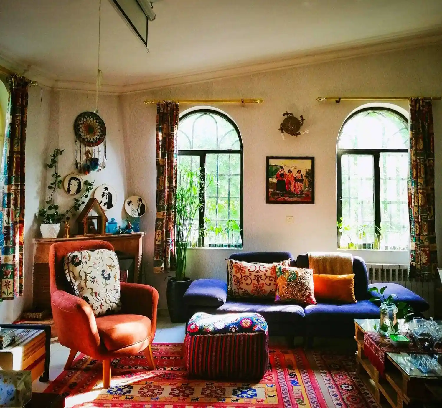
Similarly, contemporary eclectic interior design thrives on contrast, blending vintage pieces, modern artwork, and unexpected textures for a captivating living space. This style celebrates the beauty of juxtaposing different eras and design sensibilities.
Embracing a fusion of tradition and modernity, contemporary southwest interior design seamlessly blends natural materials, earthy tones, and Native American motifs for a warm and inviting ambiance. Here, contrast highlights the raw beauty of the American Southwest.

- Grass Forever in Livermore: Your Guide to Artificial Turf - April 22, 2025
- German Roaches vs. American Roaches: Key Differences and Control - April 22, 2025
- 150+ Flowers That Start With S: A Comprehensive Guide - April 22, 2025