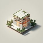
Gone are the days of dimly lit, cramped convenience stores. Today’s savvy shoppers crave a seamless blend of speed and style, demanding an experience that’s both efficient and enjoyable. Enter the exciting world of convenience store interior design, where thoughtful planning and innovative touches transform everyday errands into memorable moments.
The Essential Guide to Convenience Store Planning: Designing for Efficiency and Sales
A well-designed convenience store isn’t just about aesthetics—it’s a strategic blend of functionality and appeal that drives sales and fosters customer loyalty. Let’s dive into the essential elements that separate ordinary convenience stores from true neighborhood gems:
Phase 1: Laying the Groundwork – Architectural Design
Before a single shelf is installed, careful consideration must be given to the architectural bones of your store. This phase sets the stage for everything that follows:
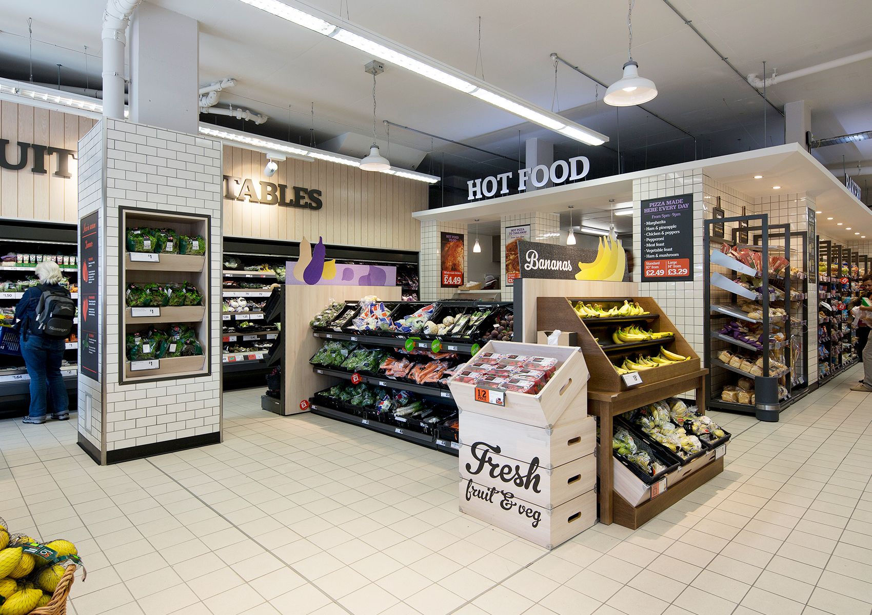
- Mapping Out Success: Floor Plan Optimization A successful convenience store guides customers on an intuitive journey. This starts with a well-planned floor plan that maximizes space and facilitates a natural flow of traffic. Consider how customers typically move through a store and strategically position high-demand items along those paths. Don’t be afraid to experiment with different layouts to find what works best for your space.
- Setting the Mood: Lighting and Ventilation Lighting plays a crucial role in how customers perceive your store. Bright, inviting lighting creates a sense of openness and showcases products in their best light. Incorporate a mix of ambient lighting for overall illumination and task lighting to highlight specific areas like promotional displays or the checkout counter. Additionally, ensure proper ventilation to maintain fresh air circulation and a comfortable shopping environment.
- Safety First: Prioritizing Security Measures A safe and secure environment is paramount to customer confidence. Integrate essential safety features like strategically placed security cameras, well-lit entryways and parking lots, and readily accessible panic buttons.
Phase 2: Creating an Experience – Interior Design
With the architectural foundation in place, it’s time to infuse personality and functionality into your store:
- The Art of Persuasion: Product Display Strategies Product placement can make or break a sale. Employ strategic display techniques to maximize visibility and encourage impulse buys. Position high-margin items at eye level and create enticing end-cap displays to draw attention to new products or promotions. Consider grouping related products together to inspire additional purchases.
- Guiding the Way: Signage and Wayfinding Clear and concise signage is crucial for effortless navigation. Use large, easy-to-read fonts and contrasting colors to ensure visibility. Consider implementing a color-coded system for different store sections or product categories. Strategically placed wayfinding signs help customers locate specific products or areas quickly, reducing frustration and enhancing their shopping experience.
- Behind the Scenes: Employee Workspace Design A well-designed workspace for your employees translates to a more efficient and enjoyable work environment. Optimize the layout of your back-of-house areas to facilitate smooth operations. Provide ample storage space, comfortable break areas, and ergonomically designed workstations for your team.
Phase 3: Curb Appeal and Beyond – Exterior Design
Don’t underestimate the power of first impressions. Your store’s exterior should be as inviting and well-maintained as its interior:
- Making a Statement: Facade Design Your storefront is the face of your business. A well-designed facade should be visually appealing, reflecting your brand identity, and attracting attention from potential customers. Incorporate large windows to allow natural light and provide a glimpse into the store’s interior. Consider using eye-catching signage and architectural elements that align with your brand aesthetic.
- Illuminating the Night: Outdoor Lighting Effective outdoor lighting is crucial for both safety and visibility, especially during evening hours. Ensure your store exterior, parking lot, and gas pumps (if applicable) are well-lit to create a welcoming and secure environment for customers. Consider using energy-efficient LED lighting options to reduce energy consumption.
- Seamless Transitions: Parking Lot Design A well-designed parking lot can significantly enhance the customer experience. Provide ample parking spaces, clearly marked entrances and exits, and designated areas for deliveries. Pay attention to traffic flow within the parking lot to ensure smooth transitions for both entering and exiting vehicles.
Factors Impacting Convenience Store Design
Beyond the core design principles, several other factors influence the success of your store’s design:
- Decoding Customer Desires: Understanding Behavior To truly tailor your store to your target audience, you need to understand their shopping habits, preferences, and pain points. Conduct customer surveys, analyze sales data, and observe customer traffic flow to gather insights into what products they frequently purchase, how much time they typically spend in the store, and what areas or features they gravitate towards.
- Finding the Sweet Spot: Product Assortment Optimization Your product selection should align with the needs and preferences of your target market. Analyze sales data to identify your best-selling items and consider local demographics, traffic patterns, and competitor offerings when making decisions about your product mix. Don’t be afraid to adjust your offerings based on customer feedback and changing market trends.
- Embracing the Future: Leveraging Technology Technology can significantly enhance both the customer and employee experience. Implement modern point-of-sale (POS) systems for faster transactions, explore self-checkout kiosks to reduce wait times, and consider integrating mobile ordering and curbside pickup options for added convenience. Utilize inventory management software to streamline stock control and minimize waste.
Unique Insights: Elevating Your Convenience Store Design
Here are some innovative approaches to further enhance your convenience store design:
- Going Green: Sustainability in Design Incorporating sustainable design elements not only benefits the environment but also resonates with increasingly eco-conscious consumers. Explore using recycled and reclaimed materials, energy-efficient lighting and appliances, and water-saving fixtures. Consider implementing composting and recycling programs to further reduce your store’s environmental impact.
- More Than a Store: Building a Community Hub Position your convenience store as a gathering place for the local community. Offer comfortable seating areas, free Wi-Fi, and charging stations to encourage customers to linger. Partner with local businesses for cross-promotional opportunities and consider hosting community events to foster a sense of belonging.
- The Power of One: Hyper-Personalization in Design Leverage data analytics to tailor the shopping experience to individual customer preferences. Implement personalized recommendations based on past purchases, offer targeted promotions through a loyalty program, and even adjust product displays based on real-time customer data. This level of hyper-personalization can significantly enhance customer engagement and loyalty.
By embracing these design principles, understanding your target market, and staying ahead of industry trends, you can create a convenience store that’s not only visually appealing but also drives sales, fosters customer loyalty, and becomes a valued asset to the community.
What are the Key Elements of Effective Convenience Store Interior Design? – convenience store interior design
Now, let’s delve deeper into the specific elements that contribute to an exceptional in-store experience:
1. Planning Your Space: Making it Easy to Navigate
Imagine walking into a store where everything is easy to find, aisles are spacious, and the layout makes sense. That’s the power of a well-planned convenience store. Here’s how to achieve it:
- Traffic Flow and Product Placement: Think like a customer – what are the most common paths they’ll take? Arrange your layout to encourage a natural flow, minimizing congestion and maximizing product visibility. Place high-demand items along these main pathways and consider using different flooring materials or colors to subtly guide customers through the store.
- Space Optimization: Every square foot counts. Utilize adjustable shelves and go vertical to maximize storage without sacrificing valuable floor space. Employ creative storage solutions like under-shelf baskets or hanging displays for smaller items.
- Accessibility for All: Ensure your store is welcoming and accessible to everyone, including individuals with disabilities. Designate wider aisles, install ramps where needed, and position essential items on lower shelves for easy reach.
2. Light it Up: Setting the Mood
Lighting is more than just illumination; it’s a powerful tool for shaping the atmosphere of your store. Here’s how to use it effectively:
- Brightness and Color Temperature: Opt for bright, warm lighting that creates a welcoming and comfortable environment. Consider the color temperature of your lighting – warmer tones tend to be more inviting for retail spaces.
- Highlighting Products: Use a combination of ambient lighting for overall illumination and accent lighting to showcase specific products or displays. Track lighting can be particularly effective for highlighting new arrivals or promotional items.
- Energy Efficiency: Embrace energy-efficient lighting options like LEDs. They not only reduce your energy consumption and costs but also last longer than traditional bulbs, saving you money on replacements.
3. Show Off Those Products: Strategizing for Sales
The way you display your products can significantly impact customer behavior and ultimately, your bottom line:
- Prime Real Estate: Eye-Level Placement: Position your best-selling and high-margin items at eye level where customers are most likely to see them. Use this prime shelf space strategically to promote impulse buys and highlight new products.
- Clear Signage and Labeling: Make it easy for customers to find what they’re looking for with clear, concise signage. Use large, easy-to-read fonts and contrasting colors. Consider adding product descriptions or benefits to entice customers.
- Cross-Merchandising Magic: Increase basket size by strategically placing related items together. For example, position chips and salsa near the beer cooler or place batteries near the electronics section.
4. Tech it Out: Embracing the Future of Convenience
Incorporate technology to enhance convenience for both you and your customers:
- Self-Checkout Kiosks: Offer self-checkout options to speed up transactions, especially during peak hours. This allows customers to quickly grab and go while freeing up your staff to assist with other tasks.
- Mobile Payment Solutions: Enable contactless payment methods like Apple Pay and Google Pay to cater to customers’ preferences for quick and seamless transactions.
- Data-Driven Decisions: Utilize data analytics to track sales trends, identify customer preferences, and optimize your product assortment. This valuable information can help you make informed decisions about inventory, pricing, and promotions.
5. Setting the Vibe: Creating a Destination
Go beyond the transactional and create a space that customers actually enjoy spending time in:
- Sensory Appeal: Engage all the senses to create a welcoming and memorable experience. Consider a subtle, pleasant aroma like freshly brewed coffee, play upbeat background music, and use comfortable flooring materials in high-traffic areas.
- Comfortable Seating: If space permits, create a designated area with comfortable seating where customers can relax, enjoy a cup of coffee, or wait for a rideshare. This simple addition can transform your store from a quick stop into a destination.
- Local Flair: Inject personality and connect with the community by incorporating local artwork, showcasing local products, or partnering with nearby businesses for cross-promotions.
How Can You Optimize Layout and Space Utilization in a Convenience Store? – convenience store interior design
Let’s get practical and explore actionable steps to maximize the efficiency and appeal of your store’s layout:
Think Like a Customer: Mapping Out the Flow
Before you start rearranging shelves, step into your customers’ shoes and visualize their journey:
- Natural Flow: Enter the store as a customer would and observe the most natural path you take. Are there any bottlenecks or awkward turns? Rearrange fixtures and displays to encourage a smooth, intuitive flow throughout the store.
- Vertical Space: Maximize your vertical space by using tall shelving units that extend upwards. Reserve lower shelves for frequently purchased items and utilize higher shelves for backstock or less-frequently purchased products.
Modern Makeover: Style and Substance
Infuse a touch of modernity and style without sacrificing practicality:
- Digital Integration: Embrace technology by incorporating self-checkout kiosks and digital signage. Use digital displays to showcase promotions, introduce new products, or create interactive experiences.
- Updated Fixtures and Finishes: Give your store a fresh look with updated lighting fixtures, sleek shelving units, and modern flooring materials. Choose durable, easy-to-clean finishes that can withstand high traffic.
- Health-Conscious Choices: Dedicate a prominent section to fresh produce, healthy snacks, and grab-and-go meals. This caters to the growing health-conscious consumer base and positions your store as a destination for convenient and nutritious options.
Function Meets Finesse: Making it Work
Balance aesthetics with functionality to create a space that is both visually appealing and operationally efficient:
- Prioritize Bestsellers: Give your best-selling products prime shelf space at eye level and consider placing them near the front of the store for easy access. Use data to guide your product placement decisions and ensure your most popular items are always within reach.
- Clear Sightlines: Maintain clear sightlines throughout the store so customers can easily scan the shelves and locate what they need. Avoid creating visual barriers with tall displays or cluttered arrangements.
- Streamlined Operations: Design your checkout and staff areas for maximum efficiency. Ensure enough counter space for bagging items, designate a clear area for customer service inquiries, and optimize the layout of your back-of-house area to facilitate smooth inventory management and restocking.
Happy Customers, Happy You: Building a Community Hub
Transform your convenience store into a welcoming destination that fosters a sense of community:
- Active Feedback Loop: Encourage customer feedback through suggestion boxes, online surveys, or even informal conversations. Actively listen to their suggestions and be open to making adjustments based on their needs and preferences.
- Above and Beyond: Go the extra mile by providing amenities that enhance the customer experience. Offer free Wi-Fi, designate a comfortable seating area, and ensure your restrooms are clean and well-maintained.
- Local Partnerships: Partner with local businesses for cross-promotional opportunities or even host community events within your store. This strengthens your connection to the community and positions your store as a neighborhood hub.
How To: Branding Your Convenience Store Through Design – convenience store interior design
Your store’s design is a powerful tool for communicating your brand identity and creating a memorable experience for your customers. Here’s how to leverage design elements to strengthen your brand:
1. Let Your Brand Personality Shine Through
Infuse your brand’s personality into every aspect of your store’s design, from the color palette to the signage:
- Color Psychology: Choose colors that align with your brand’s personality and evoke the desired emotions. For example, vibrant colors like orange and yellow convey energy and optimism, while cooler tones like blue and green suggest tranquility and trust. Refer to our guide on classical interior design for more insights on color palettes.
- Typography Matters: Select fonts that reflect your brand’s personality and ensure they are legible from a distance. A playful script font might be suitable for a family-friendly convenience store, while a bold sans-serif font could convey a more modern and sophisticated image.
- Logo Placement: Your logo is the visual representation of your brand, so display it prominently throughout the store. Feature it on signage, employee uniforms, shopping bags, and even consider incorporating it into the flooring or wall design.
2. Customers First: Designing for Easy Shopping
Prioritize the customer experience by creating a layout that is intuitive and easy to navigate:
- Seamless Flow: Guide customers on a clear and logical path through the store, using a combination of aisle placement, signage, and even subtle flooring changes. Avoid creating dead-ends or areas where customers might feel trapped.
- Strategic Lighting: Use lighting to highlight key areas like new arrivals, promotional displays, and the checkout counter. Ensure aisles are well-lit for easy product visibility and create a welcoming ambiance with warm, inviting lighting.
- Checkout Efficiency: Make the checkout process as quick and painless as possible. Have enough registers to accommodate peak hours, consider a dedicated express lane for small purchases, and ensure the area is well-lit and organized.
3. Making the Most of Your Space
Maximize every square foot of your store with creative storage solutions and strategic product placement:
- Verticality is Key: Utilize vertical space to your advantage. Install tall shelving units, consider adding a mezzanine level for additional storage or display space if your ceiling height allows, and use hanging signs or displays to draw attention to specific products.
- Signage Hierarchy: Establish a clear hierarchy for your signage. Use larger, bolder fonts for main category signs and smaller fonts for subcategories or individual product labels. Maintain consistent branding and ensure signage is clear, concise, and easy to read from a distance.
- Dynamic Displays: Create visually appealing and eye-catching displays to highlight new products, seasonal items, or promotional offers. Use a variety of textures, colors, and heights to add visual interest and draw customers’ attention.
4. Creating an Atmosphere That Says “Welcome”
Transform your convenience store from a transactional space into a welcoming destination where customers feel comfortable and relaxed:
- Ambient Lighting: Use a combination of ambient, task, and accent lighting to create a warm and inviting atmosphere. Consider using dimmer lighting in seating areas to create a more relaxed ambiance and brighter lighting in areas where customers need to make purchasing decisions.
- Designated Seating: If space allows, create a designated seating area where customers can take a break, enjoy a cup of coffee, or wait for a rideshare. Choose comfortable seating options and consider adding power outlets for added convenience.
- Visual Merchandising: Elevate your product displays by using principles of visual merchandising. Group related items together, create focal points within displays, and use props or decorative elements to add visual interest and tell a story.
By thoughtfully incorporating these design elements and staying true to your brand identity, you can create a convenience store that not only attracts customers but also fosters a sense of loyalty and connection. Remember, your store is an extension of your brand, and every detail matters.
- Ceramic Tile Backsplash Ideas for Your Kitchen Remodel - December 21, 2025
- Contemporary Kitchen Backsplash Ideas for a Stylish Home - December 20, 2025
- Modern Kitchen Backsplash Ideas To Inspire Your Refresh - December 19, 2025
